
Review on ViewSonic TD2230 10 Point Touchscreen Monitor, DisplayPort 1920X1080P, 76Hz, LED - VIEWSONIC INC by Joey Friedman

Mixed feelings on my review
I really like this product but the different design options make me feel like this is a product you make if you don't care. Let's remove what works first: 1. The panel itself is of good quality, the OSD menu works well. Text is clear, colors are good, there are no blue highlights right out of the box, meaning the picture is pleasing. The brightness was factory set to 100%. I lowered it to 50%.2. Its light weight of 7.9 pounds makes it portable, which is what you need when moving it around the house or taking it to clients. Narrow bezels give it a modern look with a high screen-to-body ratio.3. It also has a rimless glass cover with a Mohs hardness of 7, which I don't believe at all given that glass scratches are a 5.5 and tempered glass is around a 6. I can only hope that the screen will withstand abrasion (in a protective case) when exposed to my trunk's NVH.4. The built-in USB 3.0 hub (version 1) is better than competing products that only have USB 2 or only uplink for the touch screen.5. The touchscreen works well - no problems. Now to the questions: 1. Not only are the connector covers on either side of the display difficult to remove, but one of the tabs was already broken the same day I received the display. This was my third attempt at removing one of the caps and I was careful. How to proceed, no idea.2. The built-in speakers are just terrible. I really can't say anything good about them, except maybe that they have something and not nothing. Imagine a transistor radio from the 1970s. No, not a new transistor radio, but a 50 year old one. These are bad speakers. It's as if an engineer found a large enough cavity in the hull and said, "Here!”3. The power supply is really tiny, so why not build it right into the display? And it would be a lot of space considering my next point.4. As others have noted, all ports are on one side, with the exception of the HDMI port, which is on the other side at the top of the cavity. Why? What corporate laziness made this decision seem normal? If you moved the HDMI port to the other side, there would be enough space for the built-in power supply. Now if you need to use HDMI, cables come out both sides of the display. So forget about tying the cables together for a neater look. Since the HDMI port is at the top of the cavity, you'll likely need to place the monitor face down to connect it, which none of the other ports need as they face to the side. Has ViewSonic performed usability testing with this display? It seems everyone was on the drum.5. The rubber on the stand is stickier and has a larger footprint than the rubber feet on the bottom of the panel. If you're trying to flip the display, it's preferable to slide forward rather than backward. This is bad since your keyboard is most likely right in front of the panel. If you want to recline it properly, you'll have to reach back and adjust it from the stand. Again, has anyone at ViewSonic done a simple usability test? Either the answer is no, or, as the sum of shortcomings shows, they just didn't care.
- A very affordable touchscreen monitor. Once you calibrate it, it's amazing 🤩
- I no longer need a monitor that could ship for free, but now it costs me $15 to ship back.
New products
Comments (0)
Top products in 🖥 Monitors
Dell G2722HS Gaming Monitor - 165Hz Adaptive Sync, Flicker-Free, Anti-Glare Display, Height Adjustable

14 Review
🖥️ SAMSUNG Odyssey G7 Monitor 32 Inch: Ultra-HD 2560X1440P, 120Hz, High Dynamic Range, Curved, LC32G75TQSNXZA

14 Review
Sceptre Professional Monitor DiaplyPort Speakers 24", 1920X1080, 75Hz, Curved, Flicker-Free, Built-In Speakers, Tilt Adjustment, HD, HDMI

54 Review
Samsung C27F398 Curved Monitor - LC27F398FWNXZA, 1920X1080P, 60Hz, Curved Screen

33 Review
Another interesting products
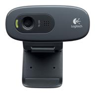
Logitech HD Webcam C270: Crisp 720p Widescreen Video Calling & Recording (960-000694), Lightweight and Portable at 3.15 lb.

192 Review
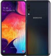
Smartphone Samsung Galaxy A50 4/64 GB, 2 SIM, black

82 Review

Apple AirPods Pro MagSafe RU Wireless Headphones, White

159 Review
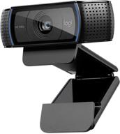
💻 Get Amazing Video Quality with Logitech HD Pro Webcam C920 (Discontinued Edition)

83 Review

