Review on Nokia 3310 Dual Sim (2017), dark blue by Aneta Kociszewska ᠌

Not quite what I wanted, but mostly okay.
Summing up, I want to say that it seems that the developers did not quite understand the concept of their brainchild, a lot was done “on the knee” and in a hurry, hence the result. In my opinion, if not deplorable, then certainly sad. I just feel sorry for the brand, because the topic is very interesting. Now many people want to return from “poking” to “buttons” and who better than Nokia to become a flagship against the backdrop of cheap Chinese consumer goods. Yes, your phones are more expensive, but you ensure the quality is normal and no one will say a bad word to you. Solution: Hire me as a feature phone project manager and the project will take off. Thank you for your attention.
- Nostalgia, of course, comes first. Slim, pleasant to the touch phone. I showed it to everyone, the first reaction was a nostalgic smile on my face. The design really worked. People love the look of the phone.
- 1. Menu "Contacts". This is where it hit me for the first time. Opposite each contact is a square for a photo. And it doesn’t matter if there is a photo or not - the box stays in its place and eats up 20% of the space under the contact name. The screen is already quite narrow, and then this square is not needed by anyone. From the name of the contact, you can see at best 13 characters, count how much the last name and first name of your boss takes, and you will understand that this is very small. Keep in mind that the line is not running, i. E. you will not be able to find out the end of the line. Why can't long contact names be written in two lines? 2. Challenges. This is where I was completely blown away. Why do people buy phones with big screens? Well right, to see more information on the screen. Do you know how information about the caller or called subscriber is displayed? The size of the field with the name of the caller is no more than 2.5 cm wide, 1 cm high! The screen fits 2 lines - 10 characters at the top and 9 at the bottom and no more. If the contact name consists of three words, then only the first two will be displayed, no matter how many characters they consist of. Let's say the contact is called "St. Petersburg Academy Lomonosov Mikhail", it will be displayed when calling as: St. Petersburg Academy… And go find out who's calling you. The most amusing (and personally enrages me) is that 50% of the entire screen space when called is simply not filled with anything, it is empty. Well, what prevented the entire space from giving the opportunity to write a name. Here the 2022 language switches from literary to obscene. 3. The phone is dual-sim and if you use only one SIM card, the screen will constantly display the inscription "No Sim" - it's terribly annoying, and it's impossible to turn off this inscription. 4. Menu WHY ARE SO MANY ICONS? Really it was impossible to organize it humanly? Why do I need icons "Music", "Video" "Voice recorder" if I don't have a flash drive? Why display a separate menu "Counters", "Snake" (complete nonsense), "Weather", "Advanced". Why is there a menu "My applications." and App & Games - WHY? That it was impossible to put everything in one menu?
New products
Comments (0)
Top products in 📷 Camera & Photo Accessories
Another interesting products

Classic Camera Bag, Evecase Large Canvas Messenger SLR/DSLR Shoulder Case With Leather Trim, Tablet Compartment And Removable Insert For Mirrorless, Micro 4/3, Compact System, High Zoom Digital Camera

41 Review
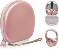
A Durable And Protective CaseSack For Bose QuietComfort And SoundLink Headphones

41 Review

Canvas Camera Case Bag With Shoulder Strap For DSLR/SLR Cameras - Black, Medium Size By Evecase

30 Review
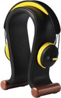
Black Leather Headphone Stand: Universal Headset Holder For Gaming And More - SAMDI Product

42 Review


