
Review on Keyboard Logitech MX Keys black, English by Wiktor Winiewski ᠌

Great product, a pleasure to use.
Personally, I would like keys without any of these dimples. A matter of taste. Its pros: Before that, I used the keyboard from iMac and Macbook Pro 2022 (everyone's favorite butterfly). So, here the keys are pressed nicer and quieter. The layout plus or minus is identical to the apple technique, except that Fn was removed from the debility corner on the left and normal delete appeared (apple keyboards, burn in hell). Switching between multiple devices is convenient. Hot keys for apple - very good. The ability to use immediately under mac and windows is just lovely. Different cons: Price At the backlight, there is a light under each key, in fact, they could not treat it in the clave for 100k pounds? Of course, I understand that you need to look at the keyboard purely from above, or not look at all when touch typing, but hmm . A short left shift and a tilde nearby - well, if they started treating apple sores, well, they would treat everything at once. Nafig this key here? Very comfortably". ate: during the work, the backlight in the dark became even more infuriating. It is especially funny that contextual advertising pops up for me, where the picture is somewhat different from reality. Below I have uploaded pictures as in reality and how they are positioned. It is immediately clear that the guys screwed up and cover up the defects.
New products
Comments (0)
Top products in 💎 GEM Box
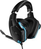
Logitech G635 DTS Surround LIGHTSYNC

22 Review
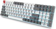
💻 RK ROYAL KLUDGE RK100 Wireless Mechanical Keyboard - Bluetooth5.1/2.4G/Wired 96% Full Size, 100-Key Hot Swappable with PBT Keycaps, Gateron Brown Switch, for Mac Windows - Carbon

9 Review
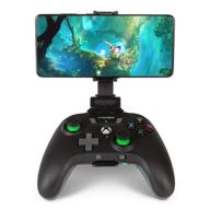
🎮 Enhance Your Gaming Experience with PowerA MOGA XP5-X Plus Bluetooth Controller for Android and PC

8 Review
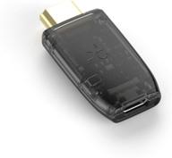
🎮 GENKI ShadowCast: Streamline Console Gaming on Your Laptop with Smallest Capture Card

9 Review
Another interesting products

Полный сборник фильмов о сериале "Йеллоустоун

3 Review

✨ AIMISUV Очки с блокировкой синего света 2 шт. - Очки от усталости глаз компьютерного гейминга (Черный Золото+Кристалл Золото)

9 Review

🔵 5-пачка, синий Ethernet-патч-кабель Amazon Basics Cat-6 RJ45 без зацеплений, длиной 3 фута.

3 Review

✨ Снимите усталость глаз с легкими антиблок-очками ANRRI.

4 Review

