Review on Keyboard Logitech MX Keys black, English by Micha Kobiaka ᠌

I am satisfied, the product fully corresponds to the description.
Fire the designer who came up with this key layout. With the quality of Claudia, in general, everything is ok. Materials, design, assembly, keys - everything is a pleasure. But this is a working clave. Why was so perverted with the location? I received it on January 26, it was almost fully charged, I used it without backlighting, and only on June 9 did the red light blink, signaling a low charge. That is, it lasted 4 and a half months on a single charge. By the location of the keys, I later found out that this is the standard Mac layout. Well, at least they don’t have anything else instead of ESC
- - Materials - Build quality - Pleasant keystrokes - Convenient size (easy to reach even the top row of keys) - Sustainability. Weighs almost 1kg and does not ride on the table at all - Confident reception. There were no problems - No noticeable lag - Autonomy. I use it without backlight. It's been almost 4 weeks since purchase and hasn't charged yet. I use 3-4 hours a day
- - Location of F keys. Why did they put key 13 in there? Out of habit, to press F12, you reach for the last one, and then increase the volume (well, at least not in flight mode). You could safely leave 12 and make a standard division into 3 groups of 4 to make it convenient (especially since the 13 key is so useless that I don’t even know why it is needed) - Location of function keys. Why at the very beginning placed the screen brightness adjustment. Desktop PCs do not support this functionality and it turns out that the most useless keys come first. Well, at least you can reassign and put, for example, the volume instead. It would be better to adjust the brightness on the arrows as usual, this is done on laptops. - Short shift. No matter how hard you try, but if you use complex combinations like CTRL + SHIFT + C / V , then it's very difficult to get used to it. In games, the rules, but at work (and it's kind of like a working keyboard), this interferes. I had to reassign this adjacent key through Power Toys to shift. - The location of the print screen keys and its neighbors. This is a working keyboard and these keys are often used. Why do I need useless 3 buttons instead of them that I don’t press at all?
New products
Comments (0)
Top products in 💎 GEM Box
Another interesting products

✨ Alleviate Eye Fatigue with ANRRI's Featherweight Anti-Blue Light Glasses

4 Review

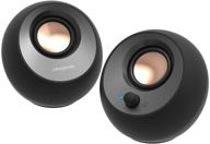
Creative Pebble V3 Minimalistic 2.0 USB Type-C Desktop Speakers with USB Audio, Clear Dialog Enhancement, Bluetooth 5.0, 8W RMS + 16W Peak Power, USB Adapter Included (Black)

8 Review

🔵 5-Pack, 3-Foot Blue Amazon Basics Snagless RJ45 Cat-6 Ethernet Patch Internet Cable

3 Review

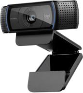
💻 Get Amazing Video Quality with Logitech HD Pro Webcam C920 (Discontinued Edition)

83 Review


