
Review on 🖥️ Get Your Hands on Microsoft Desktop 3000 Wireless Keyboard and Mouse Combo by Mateusz Rzeczycki ᠌

Nothing special, there are positive and negative sides.
Before that, there was a Logitech s510 keyboard, yes, an old one, and everything about it suited me. The only thing that was frustrating in it was the “delete-home-end…” button block, an extremely bad layout that I never got used to. But she died, I had to take something new. The choice fell on Microsoft, because. there was an action, and I took it without looking, and I heard a lot of laudatory reviews about it. But what I encountered by buying it led to frustration. Mikey can't in a good clave design. The mice come out great, but the claves are extremely miserable Klava is of a laptop type (and I didn’t write it down as a minus, because I didn’t see it when I bought it). I don't like these. You can get used to it, even began to like it a little. But I do not have enough tactile sensation of the key travel, the tactile feedback from pressing is somehow sluggish, I simply do not feel their travel The big "Delete" was written in pluses, because. huge buttons are convenient, but for me it would be better if the “Insert” button was returned to its place, and “Delete” was made to a normal size. Because I really need the "PrtScn" button The bulge on the clave, as for me, does not add any ergonomics. A direct comparison in typing on a simple one and this one, I did not notice a difference in typing speed and sensations in the hands. This bulge is more likely not about convenience, but about “ooh . what an unusual garbage.” Moreover, it requires getting used to, because. at first, fingers will stumble on the wrong buttons Fakap with "PrtScn" and "Pausa-Break" is easily solved by reassigning buttons, but damn it, these are crutches and relearn again Conclusion. I took another Logitech, and took it to work. Had I known in advance that I would encounter such problems, I would not have taken it. I began to appreciate Logitech again, for supporting old operating systems, separate player control buttons, the presence of such seemingly optional buttons as “PrtScn” and “Pausa-Break”. This keyboard has one plus, I began to understand that huge buttons are very convenient, that's what other manufacturers need to adopt from Microsoft - a huge row of bottom buttons
- Removable arm rest. Soft leatherette. Over time, it will rub off and lose its appearance - 100%, because Claudia I use debt. The last one was taken 20 years ago. But while new, it looks expensive, rich Silent keyboard and mouse. The mouse has a nice quiet click. Large buttons in the bottom row - a buzz, I have not seen anything more convenient. This is a huge plus Big "Delete". Large buttons - very convenient The mouse is comfortable, the size is larger than small cheap mice for a laptop, but I would like a larger size. Two AA batteries are inserted into the mouse, and from this it becomes weighty. I love heavy mice, this is a plus for me I don’t feel connection breaks, signal loss, because receiver 20 cm from the keyboard Giant gaps. It is very easy to press them, you will not miss
- Due to the fact that the buttons are located in an arc, the bottom row of buttons is greatly stretched. "Ctrl + V" can be forgotten for the time of getting used to, because. I always hit "C" with my index finger. The distance from "Ctrl" to "V" is 7 mm longer than conventional keyboards. And believe me, after 20 years of blind typing, you will feel this cant. The silly Windows key was made huge. “Windows” would be better, and “Ctrl” was made closer to “V” There is no "Pause-Break" button. And it is very lacking, because. Punto hangs on it, I had to get used to a different combination After approximately 15 seconds of pause in operation, the first press of any button does not work. Apparently, the keyboard falls asleep, and the first press always wakes it up. It is inconvenient to type from here, because you have to go back to the beginning of the word and add the missing sign. It may be connected somehow with Windows 8.1, tk. the axle is not fresh, there may be problems with it Well, because of the ugliness, and for this you need to kick the developer hard, the “PrtScn” button was hung on an additional row, and it is activated after switching the toggle switch. I work as a designer and I really need PrtScn. Here is “Insert”, which has never been useful to me in 20 years, it was hung on the main row. And "PrtScn", which is used very often, was taken out as optional, not mandatory. There are no words, one mate, of course Buttons to increase, decrease the sound, control the player, etc. controlled after switching the toggle switch. It is not comfortable. It is more convenient when these buttons are made optional. I often control the player during work and pull the toggle switch back and forth and constantly monitor what position it is in, well, that's it. Damn, the keyboard is ergonomic, it's about ease of use, but here are some compromises Windows 10 software works perfectly. But on Windows 8.1 it works through one place. The software sees only the mouse, and does not want to see the keyboard. Microsoft seriously? Your axis, albeit an old one, does not see Claudia? Before that, there was Logitech 270, which is half the price of Microsoft Sculpt Comfort, and its software worked flawlessly
New products
Comments (0)
Top products in ⌨️ Keyboards, Mice & Accessories
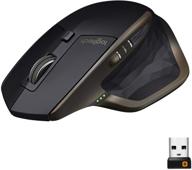
🖱️ Logitech MX Master Wireless Mouse: High-Precision Sensor, Easy-Switch up to 3 devices, Meteorite Black

322 Review

🖱️ Renewed Logitech M705 Wireless Marathon Mouse: 3-Year Battery & Hyper-Fast Scrolling in Ergonomic Black Design for PC/Laptop with Unifying Receiver

421 Review
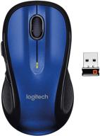
Logitech M510 Blue Wireless Mouse with USB 🖱️ Unifying Receiver - Comfortable Shape, Back/Forward Buttons and Side-to-Side Scrolling

199 Review
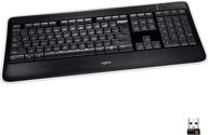
Renewed Logitech K800 Wireless 💡 Illuminated Keyboard: Brighter, Better, and More Convenient

204 Review
Another interesting products

Smartphone Samsung Galaxy A50 4/64 GB, 2 SIM, black

82 Review
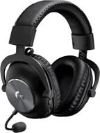
Renewed Logitech G PRO X Wireless Lightspeed Gaming Headset with Blue VO!CE Mic Filter for Immersive Gaming Experience

122 Review
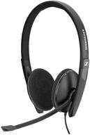
Sennheiser PC 8 2 Cancelling Microphone

71 Review
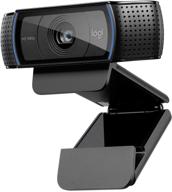
💻 Get Amazing Video Quality with Logitech HD Pro Webcam C920 (Discontinued Edition)

83 Review

