Review on Keyboard Mouse Kit Microsoft Sculpt Comfort Desktop Black USB by Stanislaw Mlekodaj ᠌

The product can be used, I expected a little more.
Prior to that, I had a Logitech S510 keyboard. It was, you guessed it, an older model, but everything about it was perfect for me. The "delete-home-end..." button block was the one thing that I found to be irritating about it. It had a really poor layout, and I was never able to get used to it. However, she passed away, and I had to find a replacement. The winner was determined to be Microsoft because. there was a move that could be made, and I made it without even looking, and afterwards I heard a lot of praise being heaped upon it. However, the circumstances surrounding my purchase of it led to feelings of annoyance. Mikey is unable to in a design for a good clave. The mice turn out wonderfully, but the claves are a complete and utter failure. The fact that Klava is a laptop wasn't something I took into consideration when making my purchase, thus I didn't make a note of it as a drawback. These aren't to my taste at all. It's possible to become used to it, and some people even start to enjoy it after a while. However, I do not have a sufficient amount of tactile sense of the key travel, the tactile feedback from pressing is somewhat sluggish, and I do not feel the motion of the keys at all. The word "Delete" was written in plus signs because large buttons are easy to use, but I think it would be more practical if the "Insert" button was put back where it belonged and "Delete" was shrunk down to a more reasonable size. Because I absolutely cannot function without the "PrtScn" button The protrusion on the clavicle does not, in my opinion, contribute anything to the ergonomics of the device. When I compared typing on a simple one to typing on this one, I did not detect any change in the feelings in my hands or the pace at which I could type. It's more likely that this bulge isn't about convenience, but rather about people going "ooh. what an unusual garbage." In addition to this, one must become accustomed to it because. at first, fingers are going to accidentally press the wrong buttons. You can easily remedy the problem of Fakap with "PrtScn" and "Pausa-Break" by reassigning buttons, but dammit it, these are crutches, and you have to remember it again. Conclusion. I grabbed another Logitech and brought it with me to the office. If I had been aware of the potential for such difficulties in advance, I never would have taken the opportunity. The fact that older operating systems were supported, separate player control buttons, and seemingly unnecessary buttons like "Pausa-Break" and "PrtScn" made me admire Logitech products all over again. The one thing that I like about this keyboard is that it has large buttons, which I've come to realize are quite useful. Other companies should take a cue from Microsoft and design their keyboards with a large row of bottom buttons.
- Arm rest that can be removed. Leatherette with a soft feel. Because Claudia and I employ debt, over time it will wear out and lose its appearance completely. This is a certainty. The most recent one dates back some two decades. But despite its youth, it exudes an air of luxury and wealth. Both the keyboard and the mouse are silent. The click of the mouse is lovely and subtle. I have not encountered anything that is more user-friendly than the large buttons that are located in the bottom row. This is a massive ace in the hole. Big "Delete". Large buttons - extremely convenient The mouse is comfortable, and its size is far greater than small, low-cost mice designed for use with laptops; yet, I wish it were even larger. The mouse gains some heft when two AA batteries are placed inside of it, as a result of which it may now be used. Since I adore heavy mice, this is definitely a benefit for me. Because the receiver is only 20 centimeters away from the keyboard, I do not experience any connection breakdowns or signal loss. Giant gaps. It is not difficult to press them, and you will not fail to do so.
- The bottom row of buttons is extremely distended since they are arranged in an arc as opposed to being aligned in a straight line. Because getting acclimated to it will take some time, you can ignore the "Ctrl + V" shortcut for the time being. My index finger is the one that presses the "C" key every time. The distance between "Ctrl" and "V" on this keyboard is 7 millimeters further apart than it is on standard keyboards. Believe me, after 20 years of typing with your eyes closed, you will feel this cant in your fingers. It was decided to make the Windows key much larger. It would be better if "Windows" was used, and "Ctrl" was moved closer to "V" The button labeled "Pause-Break" is not present. And there is a significant deficiency because. Because Punto is attached to it, I had to adjust to using a new combination. After there has been a break in the operation for around 15 seconds, the first press of any button will not have any effect. It would appear that the keyboard has a sleep mode, yet pressing any key would always bring it back to life. When you type from this location, it is cumbersome because you have to go all the way back to the beginning of the word to add the character that is missing. It's possible that this issue is related to Windows 8.1 in some way, tk. Because the axle has not recently been replaced, there may be issues with it. The "PrtScn" button had to be moved to an additional row due of its ugly location, and it can only be engaged after the toggle switch has been turned on and off. For this reason, you should give the developer a good swift kick. PrtScn is an essential tool for my line of work as a designer. In the past 20 years, "Insert" has never been of any use to me, and yet it was hung on the primary row. Also, the "PrtScn" command, which is utilized quite frequently, was removed since it was considered to be non-essential rather than essential. There are no words, my friend, of course, and there are none. The buttons that control the player, the volume of the sound, and other aspects of the experience are controlled once the toggle switch is flipped. It is not a pleasant experience. If these buttons could be made optional, it would be much more convenient. During the course of my job, I frequently take control of the player, during which I alternately pull the toggle switch between two positions and continually keep track of where it is now set. Damn, the keyboard is ergonomic, and it's all about convenience, but here are some of the trade-offs you'll need to make. The software for Windows 10 operates flawlessly. On the other hand, Windows 8.1 only need one location to get things done. The software only recognizes the mouse and expresses no interest in recognizing the keyboard. Are you kidding me, Microsoft? Your axis, despite the fact that it is an old one, does not see Claudia, does it? Before that, there was the Logitech 270, which had software that functioned perfectly and cost only one-half as much as the Microsoft Sculpt Comfort system.
New products
Comments (0)
Top products in ⌨️ Keyboards, Mice & Accessories
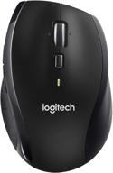
🖱️ Renewed Logitech M705 Wireless Marathon Mouse: 3-Year Battery & Hyper-Fast Scrolling in Ergonomic Black Design for PC/Laptop with Unifying Receiver

421 Review
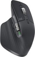
Renewed Logitech MX Master 🐭 3 Advanced Wireless Mouse: Exceptional Performance Guaranteed

233 Review
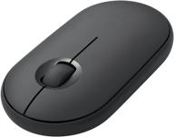
Wireless Bluetooth Graphite 🖱️ iPad Mouse - Logitech Pebble i345

184 Review
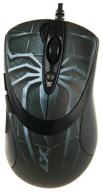
A4Tech XL-747H Gaming Mouse, Blue Spider

190 Review


