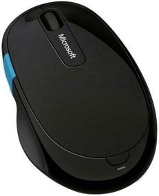
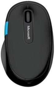
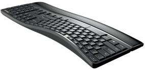
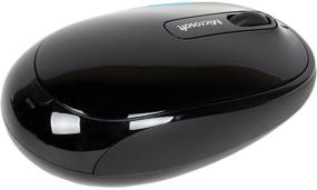
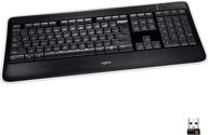
The bottom row of buttons is extremely distended since they are arranged in an arc as opposed to being aligned in a straight line. Because getting acclimated to it will take some time, you can ignore the "Ctrl + V" shortcut for the time being. My index finger is the one that presses the "C" key every time. The distance between "Ctrl" and "V" on this keyboard is 7 millimeters further apart than it is on standard keyboards. Believe me, after 20 years of typing with your eyes closed, you will feel this cant in your fingers. It was decided to make the Windows key much larger. It would be better if "Windows" was used, and "Ctrl" was moved closer to "V"
The button labeled "Pause-Break" is not present. And there is a significant deficiency because. Because Punto is attached to it, I had to adjust to using a new combination.
After there has been a break in the operation for around 15 seconds, the first press of any button will not have any effect. It would appear that the keyboard has a sleep mode, yet pressing any key would always bring it back to life. When you type from this location, it is cumbersome because you have to go all the way back to the beginning of the word to add the character that is missing. It's possible that this issue is related to Windows 8.1 in some way, tk. Because the axle has not recently been replaced, there may be issues with it.
The "PrtScn" button had to be moved to an additional row due of its ugly location, and it can only be engaged after the toggle switch has been turned on and off. For this reason, you should give the developer a good swift kick. PrtScn is an essential tool for my line of work as a designer. In the past 20 years, "Insert" has never been of any use to me, and yet it was hung on the primary row. Also, the "PrtScn" command, which is utilized quite frequently, was removed since it was considered to be non-essential rather than essential. There are no words, my friend, of course, and there are none.
The buttons that control the player, the volume of the sound, and other aspects of the experience are controlled once the toggle switch is flipped. It is not a pleasant experience. If these buttons could be made optional, it would be much more convenient. During the course of my job, I frequently take control of the player, during which I alternately pull the toggle switch between two positions and continually keep track of where it is now set. Damn, the keyboard is ergonomic, and it's all about convenience, but here are some of the trade-offs you'll need to make.
The software for Windows 10 operates flawlessly. On the other hand, Windows 8.1 only need one location to get things done. The software only recognizes the mouse and expresses no interest in recognizing the keyboard. Are you kidding me, Microsoft? Your axis, despite the fact that it is an old one, does not see Claudia, does it? Before that, there was the Logitech 270, which had software that functioned perfectly and cost only one-half as much as the Microsoft Sculpt Comfort system.


