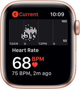
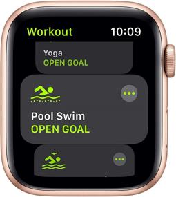
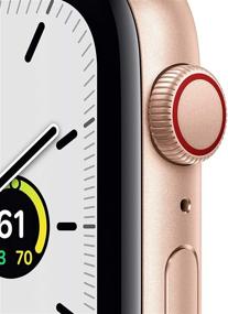
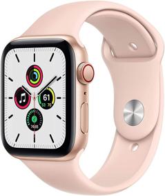
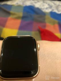
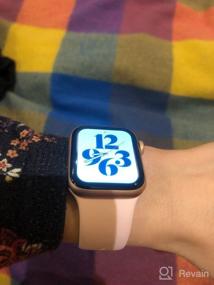
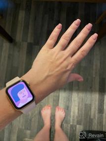
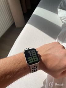
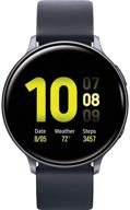
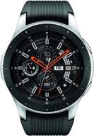
- ✅ Attention to detail in the style of Apple. Unpacking the watch is like a separate ritual, kayfanula ✅ Quality. Everything is done perfectly. Watches are expensive and you can feel it when you look at them. ✅ Decoration. Many built-in dials, the font can be chosen in any shade. Billion straps, at least change every day, all sorts of films, protections, covers, etc. All this can be bought in the nearest store. ✅ Compact and concise. Despite the small size of the display, everything is read and displayed as it should, a small powerful computer right on your wrist. ✅ Interaction between devices. Everything was set up instantly, no problems. I was also pleased with the moment when the phone is active, then notifications about messages do not come to the clock, nothing is duplicated and this is excellent (I used to go with Mi band, it was duplicated and peeped there). The call is duplicated, by the way. ✅ All information is collected in "Health". It is convenient that you do not need to switch between different applications. At the end of the day I flipped through the tape, all the numbers before my eyes. ✅ Training. Lots of modes for all kinds of workouts. Convenient to manage. All statistics in the application. The measurements are almost always accurate, although sometimes they exaggerate - I ran on the track, the clock says 4 km, the track is 3.7 km. ✅ A lot of really useful things, the same activity rings, a little motivation to move, it helps, especially if the work is sedentary ✅ After ating to watchOS 7.4, they began to work faster and the battery lasts noticeably longer (1.5 days is enough for me, before that it lasted exactly a day, although I did not change the settings)
- ✅ No sleep tracking, where phases and detailed analysis will be taken into account, third-party applications are all paid and with their own jambs, which upsets ✅ Auto-brightness that can't be turned off ✅ They are charged only from the original Apple adapter. Third-party in any, the charge goes for 10 minutes and falls off ✅ If notifications for an application (for example, What’sApp) say “without showing thumbnails”, when only the sender’s name is visible, and the content of the text itself is hidden, then the quick answer function will not work on the watch, and you will not read the text, respectively. I also didn’t like that the application icon stretched to full screen, I would like something more compact ✅ The font in the settings is at a minimum, and in the notification the text of the incoming message is large for some reason, I would like it to be smaller. ✅ Sleeping in the watch is not very convenient, they are felt on the arm (I have a small version of 40 mm). If the dream is restless, it will not be difficult to hook them on the bedside table or shuffle on the head of the bed. But while there is no tracking, I see no reason to go to bed with them ✅ Charging. They are discharged at the most inconvenient moment. By the evening, 40%, it seems to be early to charge, but by the morning the percentage is low and they will die by lunchtime. Uncomfortable but tolerable


