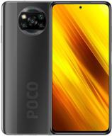
(More consumer subjective view)
1. The design is obviously lovely but impractical.
1) Whoa, but I had assumed that this cutout wouldn't disturb or interfere. But only in the second instance was I mistaken. I don't know why, but when I started viewing a YouTube video in full screen mode, the notch started to irritate me. I didn't mind at first, but after some time, I began to find it annoying. Yes, it is very large. In summary, I now prefer top and bottom bezels on smartphones, like on earlier Galaxy S9 and S8 versions, to pop-up cameras, such on the Oppo Reno 2, OnePlus 7 Pro, etc.
2) How the major chambers are constructed. Despite the fact that I hardly ever shoot on camera in general, I hit them a lot. But I want to carry a spotless smartphone around (yes, almost impossible). They would carry it out similarly to the Xiaomi Mi 9: except vertically and to the left (not in the middle! simply not in the middle!).
The power button is also too high. So that you won't start saying, "They say she's solely for turning off," let me explain. So, in order to make room for an app that will be more useful to me, I removed the Camera app from the home screen. I now use this button to launch the camera. Although I mentioned above that I don't typically use a camera, I do occasionally take pictures, and these "occasionally" mean a lot to me (I'm referring to how I start the camera, not the actual photos). Regarding the camera itself, I have nothing to add because 1. It completes all the tasks I have given it to; and 2. It overheats frequently, even in typical applications. It frightens me a little bit, but I'm not sure how the others feel.
3. The fingerprint sensor is the icing on the cake of everything wrong because, firstly, it is slow and, secondly, the sensor area is too low and small, making it harder to get in. The smartphone is prompted to completely cover the sensor, press harder, and sometimes find no matches at all.


