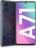
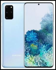
Smartphone Samsung Galaxy S20 5G 12/256 GB, blue Review
14
·
Very good

Media
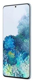
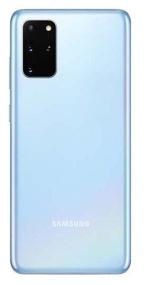

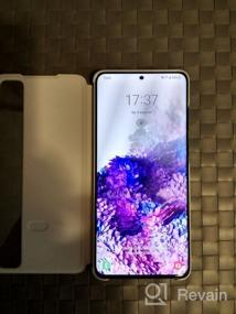
Photos by authors


Description of Smartphone Samsung Galaxy S20 5G 12/256 GB, blue
Super Powerful Smartphone with 8K Video Recording - Samsung Galaxy S20+ 5G
The Samsung Galaxy S20+ 5G is a remarkable smartphone that combines cutting-edge features with impressive performance. This high-quality device offers an exceptional user experience and is perfect for those seeking the latest advancements in cell phones & accessories.
Unmatched Performance and Stunning Display
With a lightning-fast processor, the Samsung Galaxy S20+ 5G delivers unrivaled performance that can handle even the most resource-intensive 3D games. The device boasts a remarkable display that not only showcases...
- Screen. Cameras. Proc. Rich standard equipment. . Excellent microphones. Holds a charge very well.
- Full compliance with the declared characteristics. The actual flagship from Samsung with convenient dimensions and without stripped-down functionality, unlike the S21
- A penny with cameras always gets under the fingers and requires cleaning from prints
- Screen, cameras, size, functionality, quality, battery, silicone case included in Snapdragon (Hong Kong version).
- Haven't found it yet.
- The screen on the Ultra is gorgeous. Speed is also up to the mark.
- only price
- The battery lasts over a day. The speed of the fingerprint and face. The network is secure.
- Not revealed yet
- camera, zoom, night view
- interfering with active use was not found
- 1) The design is not bad, although discreet, but in black it is beautiful and looks status (personally, I was not embarrassed by the similarity with the A-series). Very nice aspect ratio, thanks to which it is narrow. I also liked the thickness of the case, it is quite thin and lies in the hand with a grip. 2) A lot of interesting little things, for example: the ability to add an application to a folder from a male folder, rather than transferring the application to it from the screen with all the icons. Samsung dex is an interesting thing, but I have not yet implemented its full functionality. reverse charging (although with its autonomy, you most likely will not use it). very flexible one-handed control mode, although sometimes it does not work correctly with swipes. sidebar with applications, you will use it permanently, especially after you see how the multitasking gesture is drawn. 3) Wang yuai 3.1 with which I received a smartphone can be attributed to both minuses and pluses. In my case, rather the first, but it would be wrong to evaluate the system based only on my subjective opinion. It definitely has its upsides. It is beautiful, colorful, in a word it has everything to interest the buyer, who will take a brand new Samsung in his hands at the stand. But don't let them let your guard down. Since the time of tachwiz, much in the Samsung has changed for the better, but the main development paradigm has remained unchanged. This is still the same shell overloaded with unnecessary, excessively rich in USELESS functions and features, which does not have the fundamental functions that are, perhaps, everywhere. I refer to these as: the inability to edit the status bar (that is, I can’t remove the network speed, wifi, battery indicator type, although I can remove the percentage display). Not that it would be a terrible deprivation, but it would guarantee the impossibility of burning out the area where the indicator is located in a couple of years. you can’t remove the name of the icons on the desktop (afk was enabled on oxygen, because it visually looks better) no screenshot gesture with three fingers, you have to reach for the buttons
- Here is where to roam: 1) Curve and inconvenient mode of splitting the screen into two workspaces. Its inconvenience is manifested in the fact that when you open one application from above, you don’t get a desktop with all applications (or a multitasking menu) from below, but a menu of applications available for opening (where you can add them). Why I don’t quite understand this complication, because when multitasking or the desktop opens at the bottom, it is much more convenient and easier. 2) With gestures enabled, when trying to enter the Google Claudia settings, a gesture was made to switch to another application from multitasking. Xs why so, on none of the previous phones (vanplas 7t, 7pro) this was not. 3) Editing photos in FB with gestures also becomes impossible, because when you try to crop the photo vertically, the gesture works back. 4) Inconvenient and unreasonably complicated choice of horizontal-vertical orientation completely idiotic mode of selecting horizontal - vertical orientation. Example: the phone is lying on the floor in horizontal orientation, when you try to change it, you will click on the corresponding icon from the quick access curtain, and it will write you that landscape orientation is active, instead of changing it to portrait. That is, this mode has 3 states (portrait, landscape and auto-rotate). And if you need to switch from landscape to portrait without using auto-rotate, you will have to turn the smartphone over and fix its orientation. 5) The location of the volume buttons is an exceptional subject, but when they are both on the right side, it's just inconvenient for me. 6) Surprisingly, the connection is worse than on vanplace 7 pro, where 4g somehow worked for me, it will not work here. 7) On the 4th and 5th photos I attached a screen of what multitasking looks like on wang yuai and oxygen. Why so many letters? Why not designate a symbol that is familiar and familiar to everyone? Instead of "launch in split screen" do not write the obvious "split screen"? And this is the whole wang yuai.


