Review on Smartphone Samsung Galaxy S20 5G 12/256 GB, blue by Sai A Nyi ᠌

Not a bad product, but you can find better.
In general, the impressions are controversial. It seems to be like this frivolousness, colorfulness, but at the same time, the stupidity and complexity in many necessary functions interferes with life. I bought it for 45 and disappointed. Tepep Samsung for me is not seen as something expensive and premium, because the Chinese shells are only better and more functional (without becoming cluttered and unnecessary). The technical side is not bad, but I'm not sure that with such a voracious shell, it will be enough in two years (it's not for nothing that 12 GB of RAM is here). Also, I didn’t think that Samsung would save on components so much, putting screens with terrible PWM, vibration, like smartphones for 15k and nasty batteries that lose their resource very quickly. On this I will finish with the lyrics and write the impression of the main specs: 1) The screen is pleasant, juicy, with a uniform backlight (although it did not escape the fact that the shades of gray are warmer on top and cold on the bottom). However, the shimming values are horrendous, and if I can't see them, then there are plenty of people who do see flickering even at 70% brightness. 2) The performance on the snap is excellent, like that of other smartphones on 865. Here, its implementation is far from the worst. There are a lot of tests on YouTube, so I will not paint. But, what is interesting is that with such performance, some interface primitives, nevertheless, work very jerkily and as if in fits and starts (especially with gestures) 3) 128 GB of memory is terrible, very little for a 2022 sub-flagship 4) Autonomy is normal, but not constant. When it happens and 5 and a half hours, and when it lands in 4 (this is all at 120 Hz and medium brightness). It also seemed strange to me that the first 50 percent leave slowly, but the next 50 fly away before our eyes. 5) I didn’t like the camera in terms of detail (worse than on the top thirty), but I like the saturation and colors. Shirik is applicable during the day, at night like everyone else. Digital zoom is useless from the word at all. 6) The charging speed is not very good, there is a difference between 30 and 25 watts, usually it takes about twenty hours to fully charge.
- 1) The design is not bad, although discreet, but in black it is beautiful and looks status (personally, I was not embarrassed by the similarity with the A-series). Very nice aspect ratio, thanks to which it is narrow. I also liked the thickness of the case, it is quite thin and lies in the hand with a grip. 2) A lot of interesting little things, for example: the ability to add an application to a folder from a male folder, rather than transferring the application to it from the screen with all the icons. Samsung dex is an interesting thing, but I have not yet implemented its full functionality. reverse charging (although with its autonomy, you most likely will not use it). very flexible one-handed control mode, although sometimes it does not work correctly with swipes. sidebar with applications, you will use it permanently, especially after you see how the multitasking gesture is drawn. 3) Wang yuai 3.1 with which I received a smartphone can be attributed to both minuses and pluses. In my case, rather the first, but it would be wrong to evaluate the system based only on my subjective opinion. It definitely has its upsides. It is beautiful, colorful, in a word it has everything to interest the buyer, who will take a brand new Samsung in his hands at the stand. But don't let them let your guard down. Since the time of tachwiz, much in the Samsung has changed for the better, but the main development paradigm has remained unchanged. This is still the same shell overloaded with unnecessary, excessively rich in USELESS functions and features, which does not have the fundamental functions that are, perhaps, everywhere. I refer to these as: the inability to edit the status bar (that is, I can’t remove the network speed, wifi, battery indicator type, although I can remove the percentage display). Not that it would be a terrible deprivation, but it would guarantee the impossibility of burning out the area where the indicator is located in a couple of years. you can’t remove the name of the icons on the desktop (afk was enabled on oxygen, because it visually looks better) no screenshot gesture with three fingers, you have to reach for the buttons
- Here is where to roam: 1) Curve and inconvenient mode of splitting the screen into two workspaces. Its inconvenience is manifested in the fact that when you open one application from above, you don’t get a desktop with all applications (or a multitasking menu) from below, but a menu of applications available for opening (where you can add them). Why I don’t quite understand this complication, because when multitasking or the desktop opens at the bottom, it is much more convenient and easier. 2) With gestures enabled, when trying to enter the Google Claudia settings, a gesture was made to switch to another application from multitasking. Xs why so, on none of the previous phones (vanplas 7t, 7pro) this was not. 3) Editing photos in FB with gestures also becomes impossible, because when you try to crop the photo vertically, the gesture works back. 4) Inconvenient and unreasonably complicated choice of horizontal-vertical orientation completely idiotic mode of selecting horizontal - vertical orientation. Example: the phone is lying on the floor in horizontal orientation, when you try to change it, you will click on the corresponding icon from the quick access curtain, and it will write you that landscape orientation is active, instead of changing it to portrait. That is, this mode has 3 states (portrait, landscape and auto-rotate). And if you need to switch from landscape to portrait without using auto-rotate, you will have to turn the smartphone over and fix its orientation. 5) The location of the volume buttons is an exceptional subject, but when they are both on the right side, it's just inconvenient for me. 6) Surprisingly, the connection is worse than on vanplace 7 pro, where 4g somehow worked for me, it will not work here. 7) On the 4th and 5th photos I attached a screen of what multitasking looks like on wang yuai and oxygen. Why so many letters? Why not designate a symbol that is familiar and familiar to everyone? Instead of "launch in split screen" do not write the obvious "split screen"? And this is the whole wang yuai.
New products
Comments (0)
Top products in 📱 Cell Phones

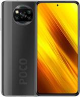
Xiaomi Poco X3 NFC DotDisplay

313 Review

📱 Huawei P40 Lite JNY-LX1 International Version - 128GB Crush Green, Dual 4G and 6GB RAM

297 Review

💎 Renewed Samsung Galaxy S8 64GB Coral Blue Fully Unlocked Phone

383 Review

Renewed Samsung Galaxy A50 Verizon Smartphone in Black with 64GB Storage

569 Review
Another interesting products

ZenPad Z8S ZT582KL / Z8 ZT582KL-VZ1 Case

5 Review

ZT582KL ZT582KL VZ1 Leather 2 Folding Android Cell Phones & Accessories

6 Review

🖊️ Black LAZY-HANDS Stylus Grip: Enhance Precision and Comfort in your Device Interaction

3 Review

Sennheiser HD 206 Closed-Back Over Ear Headphones - Discontinued Model

195 Review

