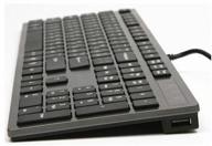
Wireless keyboard Logitech MX Keys black , Russian Review
21
·
Very good

Media
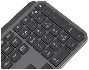
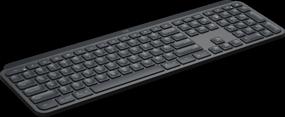


Description of Wireless keyboard Logitech MX Keys black , Russian
- Easy to use and maintains a charge nicely
- Because I couldn't push the spacebar from the sides, I had to resort to tab.
- Appearance Backlight
- The wired keyboard is inoperable! Confirmed by manufacturer's TP. No, it does not work while it is charging. However, it does not function normally over the wire until the OS has loaded. For instance, you cannot access the BIOS. (View tech support response) The most expensive option should cost between 400 and 5000 rs. Numerous bugs are present in Win10 LTSC. For instance, you might click "calculator" or "screenshot" and nothing happens; yet, after a while, a screenshot of one of the twelve calculators appears. Similarly, all Fn functions. This is quite inconvenient (it won't work; I'll give it to the shop). It appears to be another driver issue. The TP is quiet. Logitech consistently rejects requests to provide custom software. Win10 doesn't have any installed software. The TP is quiet. Keyboard additions for Mac OS. Separate versions for Windows and Mac might be created at that price. At the slightest variation from vertical, the lighting along the contour uncomfortably flashes into the eyes. This is a very aggravating truth; the backlight on the K740 is much better and more elegant. When typing alone, it feels substantial on the table surface (presumably due to the design in the shape of an arch), but the keys are not noisy at all (there are no complaints about them). K740 performs considerably better. No distinct volume keys exist. The volume can be increased, but it must be decreased by pressing Fn. Is creating another button truly that tough, or do I need to purchase Craft for this? AFTER REBOOT, DOES NOT REMEBER THE BACKLIGHT SETTINGS! those. The backlight doesn't turn on by itself after restarting or coming up from sleep mode; you have to turn it on manually! No indication of NUM LOCK. No feedback on the lighted keyboard. shoddy construction. Due to the somewhat arched shape of the case and the fact that the two rubber bands in the center are not touching the table, it shakes a lot when in use.
- just what I was anticipating. The situation is normal. The keys are very satisfying to press, and the package is attractive (not that it matters to me). the object is cumbersome and appears to have been nailed to the table.
- Now is the time to find fault. It seems fated, although I don't know why. light from below the keyboard. annoys. but I know I'll adapt eventually. The keys have an excessive number of symbols. some. but it doesn't matter to me. Typically, I don't tune in. I'm curious as to how many people here use profanity. And no, I don't have a key to the door. The last one also failed to produce immediate results. The authors state that a Makovsky-only variant exists. but unfortunately we don't sell that here. just don't give a damn. however, I am not conducting a search based on inscriptions. Plus, what else. wire for charging, I see. They like their perversions here. Not once have I ever come across these. why not just use something else? So, exactly what is the distinction, and why bother? The REGULAR wire was inaccessible. While I was typing, by the way. Almost never do I make a blunder. the rest, if it ever appears, can wait.
- Tactilely pleasant, design.
- Unable to work via USB. The backlight is activated even when it is very light and it is not needed at all. Therefore, it wastes the battery.
- materials switches like on a poppy backlight
- weak rubber bands software
- excellent quality materials comfortable low-profile scissor keys (similar to laptops) nice backlight convenient to charge from usb, no need for a separate charger and no batteries needed! together with the program for setting the keys - you can set up many convenient things, speed up the work by assigning the necessary buttons.
- could add an option with a panel for the hand (as it was on di-new age), the bottom of the keyboard "breaks" and the hand is a little unusual. it was possible to make the enter bigger, a matter of habit, but usually it occupies more than one section vertically, and here it is stretched horizontally the print-screen button is not obvious (it is there but not signed as standard) it was possible to make a small touchpad (or make a model option with it)


