
Review on 🏷️ Brother P-Touch PTH110 Lightweight Label Maker with Qwerty Keyboard and One-Touch Keys - White by Emmanuel Chouinard

. Dymo LM160 If you are going to buy a cheap label printer
Comparison Brother PTH110 vs Dymo LM160 If you are going to buy a good label printer, you might find it difficult to decide between these two models. (as I was). I recently bought this model and also had the opportunity to try the Dymo and I think it's the best. I ran some tests to determine print quality and durability, which you can see in the photos. The white label is Brother and the clear label is Dymo (I didn't have access to Dymo's white labels). The baseline print quality for a standard font is about the same for all. The pictures with the labels on the glass were taken after being washed in the dishwasher, in which both labels held up perfectly without any problems. Brother advertises their labels as laminated which greatly increases the lifespan as my sandpaper test shows. The photo of the D on the piece of wood was taken after 30 light strokes with 600 grit sandpaper. You can see Brother is the clear winner in this case. Some other things to watch out for. Other reviewers have claimed that Brother has a wasted ribbon with very large margins but they must not have known that the margins are adjustable, the default is 1 inch but you can easily make it 1/4 inch. However, with small margins, sometimes one side is slightly larger and contains a crop mark, and you need to manually crop it to size in this situation. You can view the PDF instructions on each manufacturer's website (or my links, which I'll post below) to learn more about what types of fonts, brackets, and symbols each has, but in short, Brother has many more options and you can make labels that look way more stylish than what Dymo can do. You can see an image of a silicone label with a fancy clip, outline lettering, and a shadow. I was surprised that the shadow even works with things like icons. So if you put a heart there, for example, it will also have a shadow. The menu was quite intuitive and easy to use. Most of the settings were pretty easy to find and I only had to go through the instructions a few times. In general I am very satisfied. If you want an even better one (I guess I haven't used it personally) you can go for the Brother PT-D210 which has more fonts/characters/etc. but to be honest, for me at least this one fits my needs well. Links to comparison guides[.][.]
- Nice looks
- Upgrades
New products
Comments (0)
Top products in 🖇️ Other Office Equipment
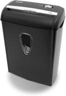
Aurora AS890C 8 Sheet Cross Cut Shredder

3 Review
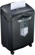
🔪 Bonsaii C149-C: 18-Sheet Heavy-Duty Cross-Cut Paper Shredder with Large Capacity Basket and Anti-Jam Technology - Perfect for Office and Home Use

5 Review
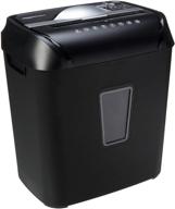
🔪 Amazon Basics 12-Sheet Cross-Cut Shredder for Paper and Credit Cards - Ideal for Home Office Use

4 Review

🏢 DYMO LetraTag 100H Handheld Label Maker - Easy-to-Use, LCD Screen with 13 Characters - Perfect for Home & Office Organization

3 Review
Another interesting products
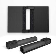
📚 CZUR Assistive Cover 13.14-inch: Splash Resistant, Adjustable Hook & Loop, PVC Material for CZUR Book Scanner - Office & Home - Black

4 Review
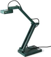
IPEVO V4K: Ultra High Definition 8MP USB Document Camera - Perfect for Live Demos, Web Conferencing, Distance Learning & Remote Teaching on Mac OS, Windows, and Chromebook

3 Review
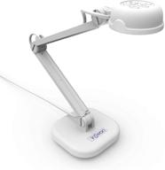
🎥 Enhance Distance Education & Web Conferencing with INSWAN INS-1 - Tiny 8MP USB Document Camera

3 Review
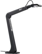
📸 AVer M5 Document Camera: USB Webcam for Remote Video Conferencing - HD for PC, Mac, Chromebook, Zoom, and More - Ideal for Distance Learning, Classroom Teaching, Recording, Working & More

3 Review

