
Review on Keyboard A4Tech KV-300H gray by Kiril Gentschev ᠌

A good product, I advise you to try it.
With all the pluses and minuses, I think this keyboard is more good than bad. Would I buy it knowing all these cons? Rather yes than no. Because other analogues for the same price suit me even less. Well, the plus is also that, judging by some reviews on YouTube, this model lasts for 5-6 years, while all the inscriptions on the keys remain and are not erased. PS. After a week of use, I decided to add to the review: this is the best keyboard that I had. I am completely delighted. Printing on it is a pleasure. And most likely this is one of the best keyboards in principle on the market (taking into account all its features, of course). At first I wanted to buy a second one, but then I decided that in a few years (4-6 years, judging by the reviews of the owners), something no less interesting might be sold.
- 1. Very light and at the same time springy pressing the buttons. All buttons are pressed equally easily, nothing sinks anywhere, etc. It looks like a good laptop keyboard. 2. There is a separating space between the top row of F buttons, it was important for me that there was a separating space to the right of F4, because I often use F2-F4, and on the previous keyboard I had to peer every time, because there, behind the F4 button, F5 immediately followed. 3. Quite weighty, stands well on the surface of the table. 4. Doesn't flex when typing. 5. Very bright and large letters of the alphabet on the buttons, 2022 and Eng. the same size. It's comfortable. Even in a dark room, the light falling from the monitor is enough to see all the inscriptions without problems (there is no backlight on the buttons). 6. Very narrow, space on the table in front of the monitor has become 2 times more. ))
- There are drawbacks, so I'll write about them too for fairness: 1. Very slippery buttons. It is especially problematic to press the left ring finger on the left Shift, the finger constantly slides off on Ctrl. 2. It would be better if the color of the housing was significantly lighter than the keys themselves. Now it is almost the same, i. E. the difference is almost not felt. The only thing that saves a little is that the color of the case is dark gray metallic, and the case is more glossy, it reflects light better and the black buttons look more distinct against its background. But still I would prefer a lighter case. Ideally - light aluminum. 3. I can't say that the keys are completely silent. Rather, it is not too loud rustling. But at night you can hardly print with impunity if someone is sleeping next to you. 4. There is no support for the left hand when printing. I didn't think it was that important. But now it is clearly felt and the hand rests not with the pad of the hand, but with the middle of the forearm against the edge of the table. It rubs the hand a little and is perceived as a whole not too comfortable.
New products
Comments (0)
Top products in 🕹️ Game Hardware
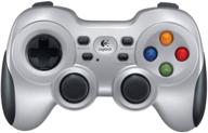
🔌 Logitech F710 Wireless Gamepad - 2.4 GHz with USB Nano-Receiver, Dual Vibration Feedback, D-Pad Switches, Compatible with PC - Grey/Black

190 Review

HyperX Pulsefire Surge - RGB Wired Gaming Mouse with Pixart 3389 Sensor 🖱️ up to 16000 DPI, 6 Programmable Buttons, Ergonomic Design, Compatible with Windows 10/8.1/8/7 - Black

111 Review
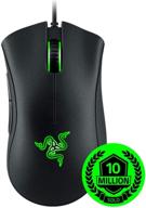
Razer Death Adder Essential RZ01-0254: The Ultimate Gaming Mouse

106 Review
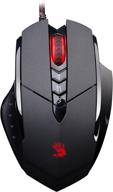
Bloody Ergonomic Gaming Rubberized Coating

264 Review
Another interesting products
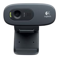
Logitech HD Webcam C270: Crisp 720p Widescreen Video Calling & Recording (960-000694), Lightweight and Portable at 3.15 lb.

192 Review
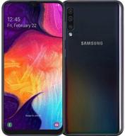
Smartphone Samsung Galaxy A50 4/64 GB, 2 SIM, black

82 Review

Apple AirPods Pro MagSafe RU Wireless Headphones, White

159 Review
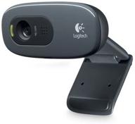
🎥 Logitech C270 Webcam: Crystal Clear Video and Superior Quality

183 Review

