1 Level
773 Review
72 Karma
Review on Strexm by Charles Fowler

Easy-to Use Platform with Lots Available
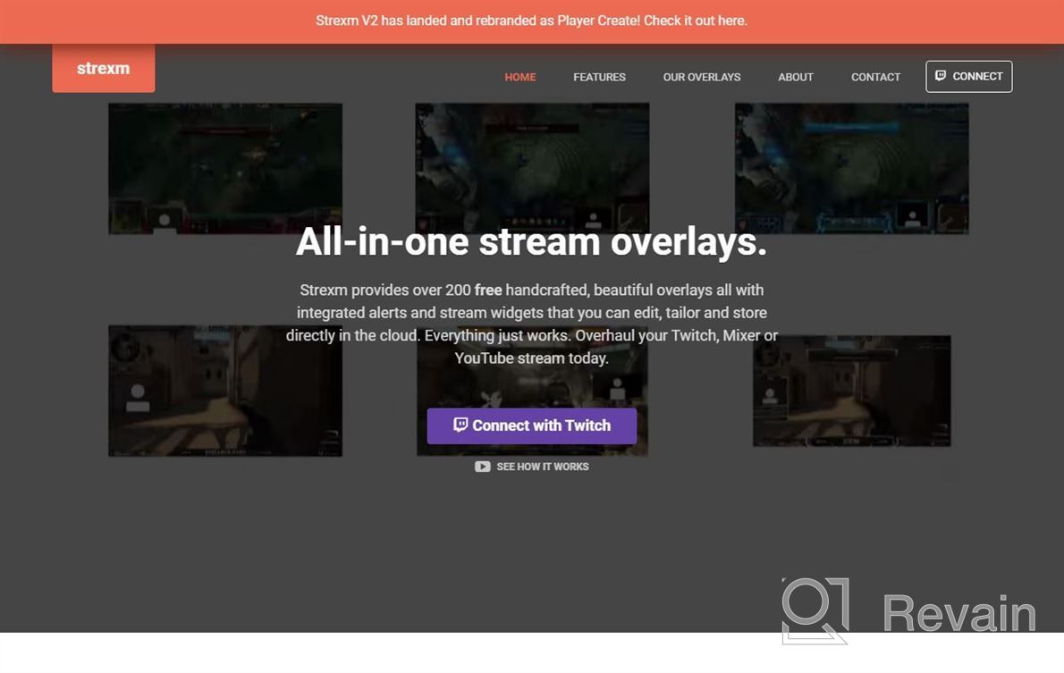
I like how easy it is for me to create my own designs or use one of their templates if needed! There are not many options available when creating new assets as there is only so much space (height/width) but they do have some freebies out now which might be helpful. The dashboard layout could possibly look better - perhaps more icons next to each other rather than scattered across multiple pages? It's hard to see what elements will fit into certain spaces at times. We've created several different overlay types; banners, carousels & images plus we also add text boxes or popups using their API integration.
