Review on 🔑 Logitech Craft Wireless Keyboard with Input Dial & Backlit Keys, Dark Grey & Aluminum - Advanced Creative Tool by o Bnh ᠌

A normal product, but they wanted more for the money.
Here is Craft, there is MX Keys. Completely identical keyboards, not counting the wheel, on which Pts. convenient to change the volume. But the question is: are you ready to overpay a few thousand (~4000) for the functionality of the volume on the wheel and because of this the increased size of the keyboard (large useless aluminum plate)? They could put additional functional keys on it, for example, in touch mode), but no. From myself I recommend buying MX Keys (I would buy it, but at the time of purchase a year ago it was not available anywhere), I would give it 4/5 only because of the location of the volume keys, calculator, etc. (there is the same illogical location) and the same weak battery (but at least it is noticeably smaller than the Craft).
- Gorgeous keys, pleasant pressing. Easily switch between different devices. Super convenient volume change on the wheel, the rest of its functionality is useless so far (see cons).
- Weak battery (with such a size, the keyboard could have been made more). Sometimes I play games, but in this case the charge drops out in 1-2 days, so in the end I don’t even pull out the charging cable. Short left shift. Before that, I used Illumination Keyboard, there was also a short shift. When they stop listening and fire that fool who turns in an unnecessary key instead of making a normal left shift. Well, the right one would have been better then reduced, as a last resort. Hang additional functionality on the Fn keys. I don't mind, I still don't use it, but changing the volume to Fn is the finish line. moreover, Mute and Vol- on the F11 and F12 keys, and Vol + on a separate one (facepalm). The software for the wheel is disgusting. The preset for Lightroom, for example, switches the wheel to step-by-step mode and it is inconvenient to use it, the rotation step immediately moves the slider not by 1 unit, but by several. I hoped that it would be possible to select sliders and spin the wheel in free mode, smoothly changing the level of certain options. In step-by-step mode, this is extremely annoying. In other applications, the functionality is also unlucky. As a result, given the extremely crooked layout of the volume keys and the poor implementation of the wheel functionality, I turned off absolutely all the presets in the Logitech application and use the wheel only to adjust the volume. This is really very convenient, I don’t like it when the volume is thrown on the F * keys and you need to use it together with Fn. Why not throw the volume over the digital block instead of the "infinitely useful" buttons for the screenshot, calculator and unnecessary blocking (that's what they had to be set on Fn) - the question. Well, the wheel is often blocked when not in use, so when you touch it to change even the volume, this stupid crunch of switching the rotation mode is also heard (again, why? You can just not block the wheel and that's it?).
New products
Comments (0)
Similar reviews
Top products in ⌨️ Keyboards, Mice & Accessories

🖱️ Renewed Logitech M705 Wireless Marathon Mouse: 3-Year Battery & Hyper-Fast Scrolling in Ergonomic Black Design for PC/Laptop with Unifying Receiver

421 Review

Logitech M510 Blue Wireless Mouse with USB 🖱️ Unifying Receiver - Comfortable Shape, Back/Forward Buttons and Side-to-Side Scrolling

199 Review

Renewed Logitech MX Master 🐭 3 Advanced Wireless Mouse: Exceptional Performance Guaranteed

233 Review

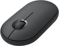
Wireless Bluetooth Graphite 🖱️ iPad Mouse - Logitech Pebble i345

184 Review
Another interesting products

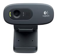
Logitech HD Webcam C270: Crisp 720p Widescreen Video Calling & Recording (960-000694), Lightweight and Portable at 3.15 lb.

192 Review

Enhance Your Visual Experience with Logitech C260 Webcam

78 Review

Renewed Logitech G PRO X Wireless Lightspeed Gaming Headset with Blue VO!CE Mic Filter for Immersive Gaming Experience

122 Review

Apple AirPods Pro MagSafe RU Wireless Headphones, White

159 Review

