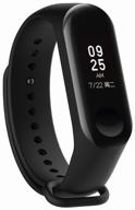
Review on Smart watch Xiaomi POCO Watch, black by Mateusz Dbkowski ᠌

The quality is at the highest level, be sure to try it.
I deliberated over the watch purchase for almost a month. I focused a lot of my attention on the aesthetics. I didn't want a fitness bracelet since I wanted the shape of a smart watch instead, which is rectangular. As a result of this, Mi Band 7 came through here. Because the Mi Band 7 Pro is presently only available in the Chinese edition and does not support the 2022 language, I choose not to purchase one. Despite the fact that they appear to be worthless when measured in silver. The size was still another crucial aspect to consider. Didn't want enormous ones. My hand is not very large. The value of autonomy cannot be overstated (so as not to charge every 2-3 days, or even more often). Poco watch took care of the arrangements for everyone. They take up very little space and have a nice appearance. In my mode, autonomy is reached after approximately 10-11 days. There is a function known as the Always on Display, which keeps the screen lit up at all times. After giving it a test, I activated it but then turned it off again. But, the loss of autonomy is not nearly as significant as the introduction of it. To be more accurate, I didn't care for how the clock seemed to be always burning. Turning them off makes for a far more pleasant experience. On the other hand, determining the time is not difficult in any way. The display illuminates whenever you turn your wrist in that direction. Even at degrees of sensitivity in the middle, the function performs admirably. The display is of high quality and quite bright. My only complaint is with the manner in which alerts are presented (I took a photo). The icon of the program or service from which the notice was generated occupies approximately a third of the visible screen space. Because of this, the text has fewer break points. It is interesting to note that the symbol will appear more condensed when the notification is viewed independently from the notification shade. And it's a whopper when it materializes all by itself after being tipped off. Because of this, it appears that the lettering fit better on the previous iteration of the Mi band 4. There are not yet a sufficient number of options available for rendering the display. Out of approximately sixty total pieces (of course, quite an amateur). In the same vein, I enjoy analog renditions of classical ones. But, the most attractive ones do not display the data that is most relevant to me (other than the time), which is the current date and the amount of steps I have taken. They display the charge and pulse rather than the voltage. I had no choice but to install a second display, which at least shows some info. There is a digital version in which everything may be found, but I've grown weary of using it. Too sloppy. Obviously, there are an extremely astronomical number of displays on the Mi band. Yet ultimately I'm happy. Really nice watch. Took for 4500
- - Outward Aspect (cool design, strict, not bulky, classic). - The Cost - The Display (high quality, bright) - Autonomy (10-13 days if without AOD and a bunch of extra monitoring) - Feature set - Moisture protection There is a GPS that has been checked out and is functional. - Monitors your activities and suggests including an exercise in your routine. There are a great deal of sensors. Monitoring of things like stress and oxygen levels in the blood are included. For the time being, disable them. I don't understand the need (particularly the tension), especially considering that you can adjust the music from your watch (which plays on the smartphone). It is helpful at times so that you do not have to continue to flatter the phone or changing the video that you are listening to while doing something else in the background. The phone is where notifications are received.
- - A limited selection of straps (several vendors on AliExpress sell the same 6-7 bracelets in a variety of colors). The Apple Watche and the Mi Band are two options that just cannot be compared. In general). - There are not many display options available (for the clock's design), which is allegedly due to the fact that clocks are not particularly popular. - The arrangement of the text in the notifications is not to my liking (little information fits) There is a mode that is supposed to allow the camera shutter to remain open for hours, however even on my Poco x3 pro (which is like one ecosystem), it does not work. Pressing the button on the watch will not trigger the camera to capture a picture. Weird. It was authorized by him. Does not function. There are icons for some but not all programs in the notifications section. Imagine for a moment that e-mail is presented in the same manner as an SMS message, but without its icon (example in the photo). Each of Telegram and Facebook's respective icons is unique. IG did not test (prohibited).
New products
Top products in 📷 Camera & Photo Accessories
Another interesting products

A Durable And Protective CaseSack For Bose QuietComfort And SoundLink Headphones

41 Review

Black Leather Headphone Stand: Universal Headset Holder For Gaming And More - SAMDI Product

42 Review

Protective Silicone Cover For Samsung Galaxy Buds & Buds+, Shock Resistant With Carabiner And Fast Wireless Charging Compatibility - Fironst Case For Galaxy Earbuds 2020 (Black)

52 Review

Canon Nikon Sony Panasonic FujiFilm Olympus Pentax DSLR Camera Bag, Evecase Large Vintage Canvas Messenger SLR Shoulder Strap Case - Gray

45 Review


