Review on VentureLoop by Victor Kakaruk

A great source and database provider, mainly used by engineers at first i guess
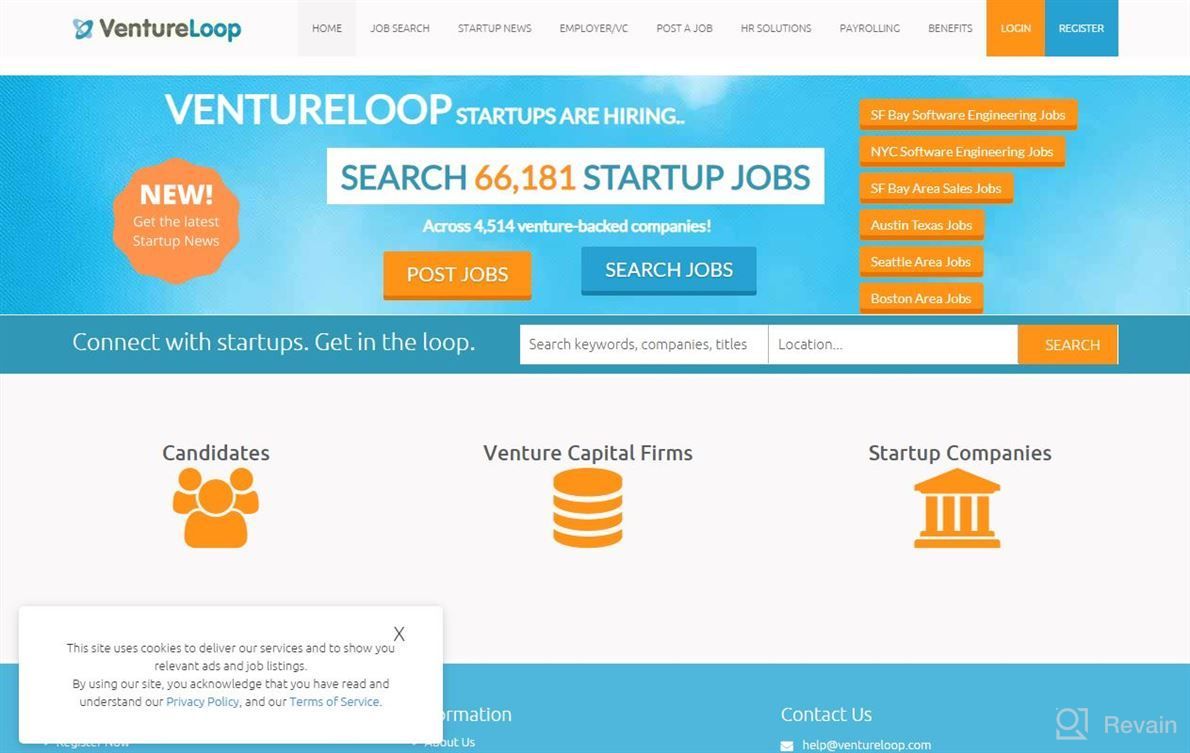
I like that it's easy to navigate through their website as there are lots of tools for you use when looking around different opportunities or startups in general! It can be hard sometimes finding what exactly your role will entail but they do have guides available which gives good insight into each opportunity/company so far (as well!) The layout could probably look better with some design improvements overall - maybe try using other software such an Adobe Illustrator? Maybe also add more features down below where people usually get stuck up front-end development work etc..

As mentioned before though this isn't really something specific about VLoop itself rather just how much information one has access too beforehand via reading all articles / watching videos online & doing research yourself firstly would make things easier later if not now ;) Also having less competition from big names outthere makes everything faster.
- Easy navigation, plenty resources.
- Great community aspect within forums :)
- Not very many job postings atm
- Lots going under "New" tab


