
Review on Game keyboard Logitech G G105 Gaming Keyboard Black usb by Adam Kaniuk ᠌

The quality is ok on the whole, it has some small flaws.
Let me just recap. I bought this Device after reading the reviews of "happy owners" and convincing me that I could overlook its flaws. The macro keys are clustered in two groups on the left side of the device, which is quite awkward. Keyboard layout showing G1 next to Esc, G3 next to Tab, and G6 next to left Ctrl. The yoga that we have what? Also, the Esc, Tab, and Ctrl keys are frequently mistakenly pressed as macro keys. This is remedied by reassigning the targeted standard keys as macro keys, however in doing so, three keys on which the relevant macros could have been recorded are lost in the process. I think we can find an answer to this dilemma. Manufacturers should move the macro buttons vertically (there is a reserve in space) and place them BETWEEN the rows of the main buttons, making them smaller and changing their shape from standard to round or oval; it is also preferable to change the surface so that the fingers "understand" that they have entered the wrong place. If only the guys at Logitech saw my review right now))) Given the noise emanating from the space bar, I'm considering trading it in for a different keyboard with better macro button placement. But, Logitech does not have regular wired keyboards available (A4tech also fell far short of my standards in terms of build quality). Take XZ, please. Perhaps I can get used to the creaky space bar and awkward macro buttons.
- Membrane keyboard that won't break the bank. Sturdy as a rock. Doesn't get on the floor or stoop over the table. Easy to record macros (no tambourine dances required) by just pressing the appropriate buttons in the correct order and at the correct speed. There appears to be a backlight, although this feature is being questioned. There is a toggle that disables the Win key, but there is a drawback that I will detail below.
- One major issue is the inconvenient placement of the customizable keys; see the Comments for further discussion. 2.The space bar started to groan after a year of use. It makes a vile groaning noise, and if you don't hear it while playing games due of the jangling music and game sounds, you certainly will when typing. Third, even at its brightest setting, the keyboard's lighting isn't sufficient for me to type by. It takes a cautious inspection in the dark to make sure there is no ice. There is no RGB either, but the single blue option is plenty for my needs given that, by happy coincidence, the system unit itself also has a blue lighting. There's a toggle for temporarily disabling the Win key, but it's not feasible to completely eliminate it. That key has to be pushed again every time the machine is turned on or reset. Neither the program nor the keyboard itself provides a way to permanently disable this key. The macro keys on the left side of the keyboard make it awkwardly long. Less area is available for mouse movements on the keyboard shelf when doing yoga. Accidental LMB clicks can occur when the mouse accidentally brushes the clave. Quick Left Turn 6
New products
Comments (0)
Top products in 🕹️ Game Hardware
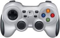
🔌 Logitech F710 Wireless Gamepad - 2.4 GHz with USB Nano-Receiver, Dual Vibration Feedback, D-Pad Switches, Compatible with PC - Grey/Black

190 Review
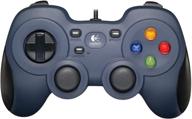
🎮 Logitech F310 Wired Gamepad Controller with Console-Like Layout and 4-Way Switch D-Pad for PC - Blue

194 Review
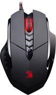
Bloody Ergonomic Gaming Rubberized Coating

264 Review
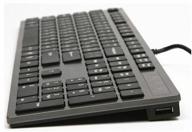
Keyboard A4Tech KV-300H gray

376 Review
Another interesting products

Apple AirPods Pro MagSafe RU Wireless Headphones, White

159 Review
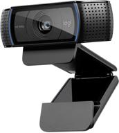
💻 Get Amazing Video Quality with Logitech HD Pro Webcam C920 (Discontinued Edition)

83 Review
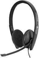
Sennheiser PC 8 2 Cancelling Microphone

71 Review
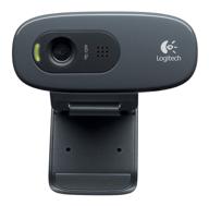
Logitech HD Webcam C270: Crisp 720p Widescreen Video Calling & Recording (960-000694), Lightweight and Portable at 3.15 lb.

192 Review

