Review on 📟 Anmino Smart Watch: Fitness Tracker with Heart Rate & BP Monitor | IP68 Water Resistant | Full Touch Screen Smartwatch | Sleep & Calorie Tracker | SMS/Call Alerts (Black) by Christopher Smith

It's a confusing and confusing smartwatch
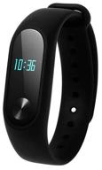
I only used this watch this morning but my first impression is that it's a confusing and confusing watch. They have two buttons, one at the top and one at the bottom. The top button appears to be for turning off the screen and when pressed again it turns on the screen on the main screen which is basically the time screen. The sole purpose of the bottom button is to confuse the user's poop. I would have thought it would be a back button that would take you back to the previous screen but obviously I was wrong as it has a mind of its own and seems to do everything EXCEPT taking you back to the previous screen. For example, I came across a calculator on my watch, decided not to use it, pressed the bottom button and instead of going back to the previous screen, it put 0 and - into the calculator. BUT? If you press the lower button when you decide that you do not want the device to measure your heartbeat, you will not return to the previous screen. Basically it does NOTHING! There are many other examples. I could see that the bottom button is not the back button. It's entirely possible that the bottom button isn't even intended to be a back button, but if so, what is it for? (Besides confusing the user?) I love the fact that this watch works with 3rd party apps like Google Voice, Mood, What's App etc. but the notification screen is also confusing. It shows the same message TWICE on the same screen. The top half of the screen will display a message from the number it was received from, while the bottom half of the screen will display the same message displayed by whatever app received the message, e.g. B. the Mood SMS app. Why does the same message have to be displayed twice? I haven't found a way to return to the notifications after reading them, or maybe not even finishing reading them, without having to press the top button to bring up the screen, swipe left, and select "Notifications" from the list of options and then select a message to read it in full. Once I've read the message I have to double tap the top button to go back to the time screen and start the process over to read the next message I may have missed. (This is another example of how the bottom button should be the back button.) Clocks aren't ALL bad. It's well built, has some Screen Time options, is feature-packed and responsive to touch (sometimes too well), and works with many third-party apps. But the bottom button, the confusing layout, the inability to access notifications without using the options list, the message pops up twice on the screen, and as another reviewer noted, showed the message only half the screen instead of all the way, z sure will be back pain. There doesn't seem to be an option to change the font size either, which is a shame since half of the text in the title is off-screen. I would love to love this watch but I can't seem to and will most likely be returning it.
- Multiple sports trackers
- Not sure
New products
Comments (0)
Top products in 📷 Camera & Photo Accessories
Another interesting products

Classic Camera Bag, Evecase Large Canvas Messenger SLR/DSLR Shoulder Case With Leather Trim, Tablet Compartment And Removable Insert For Mirrorless, Micro 4/3, Compact System, High Zoom Digital Camera

41 Review

A Durable And Protective CaseSack For Bose QuietComfort And SoundLink Headphones

41 Review

Black Leather Headphone Stand: Universal Headset Holder For Gaming And More - SAMDI Product

42 Review

Protective Silicone Cover For Samsung Galaxy Buds & Buds+, Shock Resistant With Carabiner And Fast Wireless Charging Compatibility - Fironst Case For Galaxy Earbuds 2020 (Black)

52 Review


