Review on 📷 White Canon EOS M3 - International Version (Body Only) - Enhanced for SEO by Mateusz Swierczynski ᠌

No minuses as such, comfortable to use.
I took to replace the EOS M, which I owned for about a year. He boldly dragged a chic 22-mm "fix" from the predecessor, giving the "old man" 18-55 "whale". Well, since it's a "replacement", then I will compare it with EOS M, but the advantages and disadvantages of the latter, as well as the "system" as a whole, are no longer here. I got a fairly fast AF, which the EOS M is quite reliable, but very leisurely. The turn-on speed is "normal", but not a rocket. It's not stressful. Ergonomics - much, much better. This is no longer "under the tentacle with a suction cup", but you can already cling to with your fingers. But the disadvantage is a slightly larger size due to the handle. The size has grown even more due to the folding screen. It would be better without it, honestly, and it turns to a limited extent - it will not work to turn it around and throw it to the side. They would save space and simplify the design (or they did it normally! ). The handle is frankly empty to the touch - not very pleasant. But - a twist with PASM modes and access to all pairs of variable parameters with a joystick ring and a wheel around the shutter button! The parameter icons are no longer "poke-able" - you need to press the virtual button "Q" - you won't knock down the settings by accidental touch anymore. So what's new is good: a redesigned touch interface, added direct control, mechanical manipulators, a more convenient body, wider settings, sufficient AF. Bad - the execution of the folding screen and the overall thickness. As for the picture quality, it's not bad. But I have not yet seen a radical difference, except in "weight". ated: http_://f-picture. Net/lfp/s019. Radikal. Ru/i626/1511/a4/286932b0cb92. Png/htm (remove underscore in http) It is easy to see that the picture on the right is much noisier than the picture on the left. The noises are "dirty" at the same time, they choke much worse than in the left picture. On the left we have the EOS M (first) and on the right we have the EOS M3. Alas. It would be better to leave the old matrix. The picture is RawDigger, which is called the most alive, without processing. So the new 24-megapixel Canon sensor is much more noisy than the old 18-megapixel one, and this is clearly noticeable even at ISO 400-800.
- Protected from accidental screen taps touch interface, direct access to PASM shooting parameters from a physical manipulator and the most-demanded other parameters, rubberized grip, working AF, more necessary flash settings. The built-in flash allows you to direct the light away from the subject.
- Folding screen, "empty" handle. The price/feature ratio is inferior to comparable price DSLRs. Loud shutter. Unjustified price in 2022. Big noises.
New products
Comments (0)
Top products in 📷 Digital Cameras
Canon PowerShot A480 camera, black

108 Review
Nikon D3100 DSLR Camera Body (Kit Box) - No Lens Included, International Version with No Warranty

298 Review
Canon EOS 60D: 18MP CMOS Digital SLR Camera Body - Your Next Photography Companion

125 Review
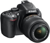
Nikon D5100 Digital SLR Camera with 18-55mm VR Lens - High Resolution 16.2MP

172 Review


