
Review on 🎵 Enhanced Performance & Sleek Design: Apple iPod touch 7 MP3 Player by Franciszka Piasecka ᠌

Good product, good quality, not bad.
About music. I go into albums like that to choose an album for myself, and then a song from it. And I see what's on the screen. That is, these overseas geniuses could not or did not want to make the most obvious option: you open the album and see a list of songs with their TITLE. And here it turns out that I have, for example, 100 albums with 10 songs each, and I have to scroll through a thousand songs manually, and guess their names with my left heel. When entering the performers, the same garbage. When you enter the "Songs" mode, you will finally be shown the names of the songs, but you will be looking for the right one either through the search, or by paging. Navigation level 80. Normally, a standard application can only be used for playlists, it’s even convenient: on a computer in iTunes, I created playlists and threw anything on wi-fi there. For music, I use the jetAudio app for 300. I load it into it via iMazing and look for music in the player in the same way as on a computer: by folders. It has only one drawback: it does not support rewinding back and forth from the headphone remote - only from the screen. There is not much to say about the battery: I don’t use it for days, I turned off all the extra nonsense, so I have enough for a few days. Bottom line: a thing for an amateur, objectively expensive (regardless of the cost of the products of this particular company), and it could not do without quite serious shortcomings. It's no joke, it's inconvenient to listen to music in the player and you have to look for a way out on the side. Apple disappointed me for the first time, before that everything suited me: iPhones 4s, 5, iPads air and regular 2022, iPod nano. But since it’s not so much that I’m completely discouraged, I take off one point, not two. I initially took it not only to music, but also as a small smartphone without a cellular connection. In this capacity, he suits me completely.
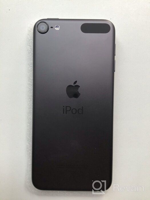
- Light weight and size (I hate shovels, even 4.7 is a lot for me), as well as a large amount of storage: almost all of my favorite songs that I have listened to in my life have got into the MP3 320 or AAC quality. In the hand lies very nicely, and the metal case inspires confidence. There are no comments on the sound, but I'm not an audiophile, I listen in the background while walking in Apple headphones with a remote control, and I'm fine. Productive, like all technology on iOS: it flies without a hint of brakes and crashes. Good main camera. At least better than my regular iPad (2022). Almost all the functions of the iPhone, except for cellular communication; by Apple standards, even the price is more or less (when compared with iPhones, which, for example, I don’t need for nothing). The external speaker is normal, it screams hard for such a baby, it tries. Lift activation. Maybe this is in all small-sized equipment of the company, I don’t know, but I really liked this function and I learned about it for the first time.
- The stock music app is so bad it's unusable (see comment). And this, *, in a device made for music! MUSIC, Carl! For 26 thousand! There is no multifunctional physical PLAY button between the volume buttons. The iPod nano has one, and it lets you pause/start playback, fast-forward, rewind, and skip to the next or previous track. No song title spoken like on iPod nano. That is, you cannot hold down the middle button on the device (because it does not exist) or on the earpods remote control and hear the name of the song and who performs it. Volume from zero to maximum with a physical button is achieved in just 16 steps, which is very small, especially compared to 32 in the nanik. That is, the same flexibility as when adjusting on the screen cannot be achieved with buttons. The slight clang of a camera glass. Moreover, as I learned from YouTube, this is not a marriage, this is in all iPods, at least new ones. He is not always heard. Moreover, if I had not found out about it on the Internet, perhaps I would not have noticed at all, but the question about the build quality still appeared. In sunglasses, you can see almost nothing in it. Solution: turn the brightness to the maximum and / or turn off the dark theme. But sorry, if I knew that the dark mode would have to be turned off, I would take the sixth touch of the same volume for several thousand cheaper. The new iOS and, accordingly, dimming is supported only by the last one at the moment, the seventh. Solution: either use only light, or set auto-change to dark with the onset of evening + set in the player so that the theme in it is the same as in the system.
New products
Comments (0)
Similar reviews
Top products in 🎧 MP3 & MP4 Player Accessories
Wireless Headphones JBL Live 650BTNC, white

78 Review
Samsung Galaxy A53 smartphone 5G 8/256 GB, black

85 Review
Smartphone Apple iPhone 11 64 GB RU, Dual: nano SIM eSIM, white

107 Review
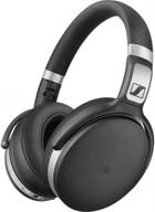
Sennheiser HD 4.50 BTNC Bluetooth Wireless Headphones Featuring Active Noise Cancellation in Black and Silver

74 Review
Another interesting products

Experience Nostalgic Music With KEiiD CD Player Retro Home Boombox: Get The Used-Like New Version For Just $99

17 Review
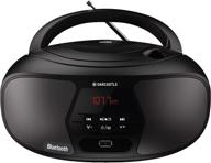
🎵 Oakcastle BX200 Boombox, Portable CD Player and FM Radio with Bluetooth Stereo Speakers and Multi-Connection Capability

9 Review
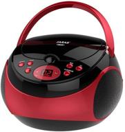
🎧 Jaras JJ-Box89: Red/Black Sport Portable Stereo CD Player with AM/FM Radio & Headphone Jack Plug - Ultimate Music Companion on the Go!

10 Review
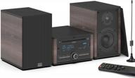
KEiiD Bluetooth Stereo Shelf System With Retro CD Player, Speakers, FM Radio Receiver, USB, AUX, Bass/Treble EQ, Wooden CD Music Bookshelf System For Home Audio

28 Review


