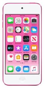
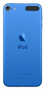
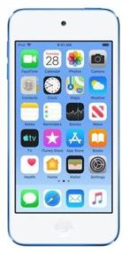
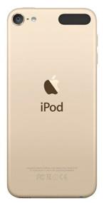
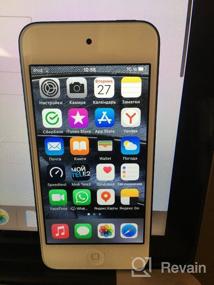
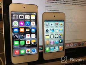
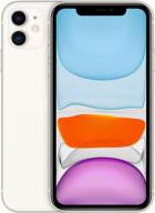
The stock music app is so bad it's unusable (see comment). And this, *, in a device made for music! MUSIC, Carl! For 26 thousand!
There is no multifunctional physical PLAY button between the volume buttons. The iPod nano has one, and it lets you pause/start playback, fast-forward, rewind, and skip to the next or previous track.
No song title spoken like on iPod nano. That is, you cannot hold down the middle button on the device (because it does not exist) or on the earpods remote control and hear the name of the song and who performs it.
Volume from zero to maximum with a physical button is achieved in just 16 steps, which is very small, especially compared to 32 in the nanik. That is, the same flexibility as when adjusting on the screen cannot be achieved with buttons.
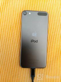
The slight clang of a camera glass. Moreover, as I learned from YouTube, this is not a marriage, this is in all iPods, at least new ones. He is not always heard. Moreover, if I had not found out about it on the Internet, perhaps I would not have noticed at all, but the question about the build quality still appeared.
In sunglasses, you can see almost nothing in it. Solution: turn the brightness to the maximum and / or turn off the dark theme. But sorry, if I knew that the dark mode would have to be turned off, I would take the sixth touch of the same volume for several thousand cheaper. The new iOS and, accordingly, dimming is supported only by the last one at the moment, the seventh. Solution: either use only light, or set auto-change to dark with the onset of evening + set in the player so that the theme in it is the same as in the system.


