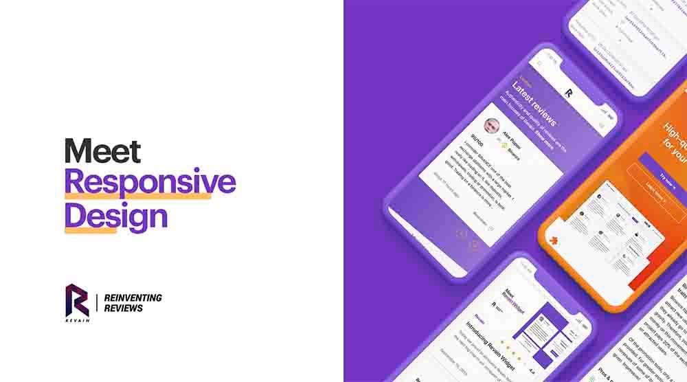
As you might notice, we have been testing a version of Revain for mobile devices quietly for some time. It has been in development for a while, as we worked to perfect all the features, and now we are ready to present you Revain's Responsive Design.
Go to revain.org from your mobile device and try brand new user interface.
Responsive design means that the user interface of Revain platform adapts to your screen size and controls. It’s made for an easy and smooth use on all possible devices, desktop, tablet or mobile.
Some websites take the path of sacrificing the functionality of mobile versions because of either effort required to optimize the UI or to simply force you to access their product by other means in order to use the full functionality. Revain went down a different road by making all the functionality accessible even on the smallest screens, and the best thing is: no functionality was sacrificed to achieve it.
Enjoy!


