
Review on Samsung Galaxy S22 8/128 GB Smartphone, black phantom by Janis Skrindzevskis ᠌

I expected more from the purchase, but not the worst option.
The "Disadvantages" section no longer appears, yet the problems remain. I won't put the reader through any more torture by repeating the obvious, but I will add something a little more personal: the interface. When compared to the S8, it's not as attractive or as comfy. And if the first is subjective, I'll offer you a cold, hard fact about the second: you can't arrange a grid of six frames wide in the native gallery; the options are four or eight. But it could be done with the S8. In spite of this, on S22, unnecessary and space-hogging frames were inserted between actual frames for no good reason. Someone would argue that these are petty details, but they contribute to one's overall perception of the gadget. As compared to the older S8, which is still on par with the best iPhone Pro models, the S22 is clearly inferior. This may seem unbelievable to people who have never used a S8 or S9, but it is in fact the case. You can feel the craftsmanship in the smooth metal frame, the rounded corners of the display and the back, and the way the gadget rests in your hand. Unfortunately, S22 has a worse quality feel and appearance. Anyone who doubt the Samsung S8's superiority need only visit an Apple store nearby and make a side-by-side comparison (not with the standard, but with the Pro series) to see for themselves. To the Samsung representative office, in the hopes that they will relay the information to the head office, which in a few years will be able to do something as legendary as the S8 again, and to the elderly like myself who have been looking for replacements for their phones for a long time while ignoring the latest Samsung lines for asymmetrical frames, I dedicate this review. You don't have to bring back curved displays, but you should create a device roughly the size of an iPhone mini or slightly larger, make it much thinner, bring back the microSD card slot and the 3.5 mm headphone jack, and so on and so forth. And no, these are not recent, intense feelings; the S22 has been part of my life for almost a month now. If you remember, Samsung, you can achieve anything.
- Despite my undying devotion to the Samsung Galaxy S8, I find it really difficult to locate even a single feature that I enjoy enough to forgive its many flaws and set it apart from the competition. Except, perhaps, for a restricted palette, from which I selected a graphite back and a matte black frame. Honestly, I probably wouldn't have purchased an S22 at all if this variant wasn't available (subjectively). So maybe you shouldn't buy anything at all; more on that later.
- I will do my best to list the drawbacks in a way that makes the most sense to me from a personal perspective: 1) The primary camera takes pictures that are consistently lower quality than those taken with my 5-year-old S8. Even while the S22's results are sometimes superior, this is most certainly not the next attainable level (the phone for me is in many ways a camera). I won't bore you with the specifics, but trust me when I say that the S22 occasionally makes such juvenile blunders that the S8 never did. The old man's photographs are also superior in clarity. 2) It is quite hard to use the phone in the case with one hand; the breadth and, notably, the thickness are clearly larger than my S8, which lies in the hand is practically perfect, although I would like even less, like the iPhone 12/13 mini; and the version is not +. The protruding cameras render it useless without a protective case; the device will not even rest flat on a table, and you will need to use more than one finger to operate it. 3) The screen is terrible. Let the laudatory reviews pile up, but I know it stacks up against my current iPhone and my old S8. I can't wrap my brain around it, but the S22 display is noticeably worse. And to the point where I'd rather not use it. The first striking feature is its intensely green hue. The manual adjustment helped a little, but my S8 and S22 are sitting next to each other, and even on the Always On Display, I can see that the S22's white hue is faulty in comparison to the S8's flawless and pleasant white. 4) I was aware going in that there wouldn't be a micro-SD card slot, but I was hoping that the benefits would exceed this drawback. The most frustrating part is that there has been no improvement in the rate at which media can be saved. 5) As many others have previously made this argument, I won't bother to elaborate on the importance of performance and independence. Before we go any further, I just want to say that I blamed interface lags on my previous S8's flaky software and rapid battery drain for years.
New products
Comments (0)
Top products in 📱 Cell Phones

Renewed Samsung Galaxy A50 Verizon Smartphone in Black with 64GB Storage

569 Review
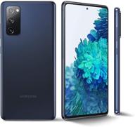
Samsung Galaxy S20 FE G780G 4G Dual 128GB 8GB RAM Factory Unlocked International Version - Cloud Navy (GSM Only)

324 Review

Xiaomi Camera Gaming Processor Unlocked

397 Review
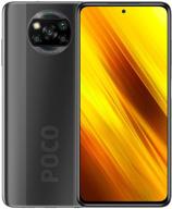
Xiaomi Poco X3 NFC DotDisplay

313 Review
Another interesting products
2PCS Pack 15.6" Laptop Screen Protector | Compatible With HP/DELL/Asus/Acer & More | 16:9 Display

41 Review
Sennheiser HD 206 Closed-Back Over Ear Headphones - Discontinued Model

195 Review
Rechargeable 12V 3000MAh Lithium Battery Pack: Power Bank For LED Strip, CCTV Camera & More

43 Review
NinjaBatt High Performance Battery For Toshiba A665 And L755 Series - 6 Cells/4400MAh/48Wh

40 Review

