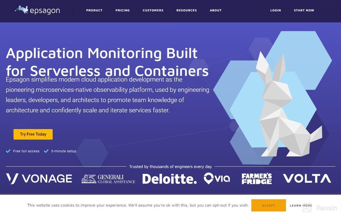
Review on Epsagon by Jacob Ashman

Good visualization app in terms with SaaS Services and microservice architectures
The visual representation of your service architecture is very good for understanding how it works together as well its strengths/weaknesses compared from different perspectives (ease or difficulty).

It's not so easy when you have many services running at once but using this tool can be helpful if used properly! I think that having too much information about each individual component makes things difficult sometimes since they're all shown separately rather than being grouped by category such like "API". Also maybe some more examples would help users get better idea what exactly we mean while talking abut Microservices Architecture Visualization Tool? We use Episgon mainly because there was no software out yet which could show us everything related to Service Oriented Architectures - whether API calls etc., So far nothing really bad has come up after trying EPISGON itself although i haven't tried any others tools either just comparing them side wise.
- Easy data visualization
- Can easily compare with other products in market.
- User friendly interface, quick response time even during high traffic periods
- Fast deployment times due low maintenance costs
- Nothing particularly came across my mind


