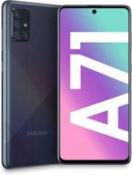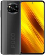
Review on Samsung Galaxy S10E by Abhi Abzz ᠌

Nothing special, there are positives and negatives.
I regarded it as a successor for the wildly popular Galaxy S7. Unfortunately, this is the only phone available that has a regular camera, protective glass, and pocket-friendly size. There is also the Mi 9 SE, although it lacks a minijack and has a protruding camera block. Impressions only differ negatively from those of the S7. The situation worsened. Even though the phone was made thinner, less text can now fit in its width. More RAM and physical memory, as well as a slightly improved camera. The benefits of a model that costs three times less cease here. Thus it is.
- Dimensions are. fits in any jacket or jean pocket. You may move about and sit down while carrying it in your pocket. No case is necessary. The block of cameras sticking out prevents the phone from swaying on the table. ++ Headphone jack everything regarded as standard for the S-series: Genuine Gorilla Glass, a regular camera, water resistance, high-quality audio, and support for the newest Bluetooth and Wi-Fi standards.
- Button for Bixby. The worst invention Samsung has made in the last 20 years is this. Ineffective, disruptive, and downright irritates. It cannot be given any useful task. - Very irritating button to turn off! You must exert strong pressure on her. The screen cannot simply be turned off with a flick of the wrist. You need a stop on the other side in order to press inward. There are volume buttons on the side directly across from that. You repeatedly press on them in an effort to turn them off, which lowers the loudness. You can't simply use your finger to turn off the screen if the phone is on a table. Pick up your phone, please. This is an error. - Taking screenshots is quite inconvenient. I playfully request that friends who appear to enjoy the phone snap a screenshot of the display. In an effort to simultaneously touch all these small unpleasant buttons, I study their surprised facial expressions. - Unfavorable sound adjusting. Formerly, the + and - buttons on phones were independent. To press them without looking was convenient. Instead of, there is now a Bixby button that you keep pressing. Feel where the plus is in your pocket and where the minus cannot be. - The screen is now thinner than the Galaxy S7 with the same proportions! Yes, indeed. They consumed the vitally important breadth space in order to create these ridiculous lengthy proportions. On a phone with the same proportions from three years ago, less text can fit vertically. - The best option is not to use screen buttons. Mechanical and Touch were more practical. - The ideal option is not a hole for the camera.
New products
Comments (0)
Similar reviews
Top products in 📱 Cell Phones
Another interesting products
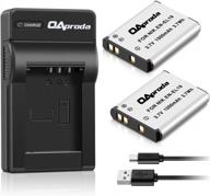
2 Pack EN-EL19 Battery & Rapid USB Charger For Nikon Coolpix S32-S7000 Cameras - OAproda

41 Review
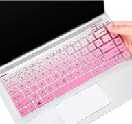
Keyboard Cover For HP Pavilion X360 14 14-Dk 14M-Dh 14-Dq/Dh 14-Fq 14-Ce/Cf 14T-Dh200 14-Dq0070Nr 14-Fq1025Nr 14-Dq0011Dx/Dq0004Dx/Dq0002 14-Dh2011Nr Fq1097Nr 14T-Dq300 14Z-Fq000 14-Cb185Nr, GPink

39 Review

F FORITO 2-Pack Anti Glare Screen Protectors For 2022 MacBook Air 13.6" With M2 Chip - Protect Your Device From Scratches And Fingerprints

33 Review
NinjaBatt High Performance Battery For Toshiba A665 And L755 Series - 6 Cells/4400MAh/48Wh

40 Review


