
Review on Cooler Master Devastator 3 Gaming Keyboard & Mouse Combo: 🎮 LED Backlit, Media Keys, 4 DPI Settings, 7 Color Modes (Model: SGB-3000-KKMF1-US) by Ted Boone

I don't like this keyboard.
Although this keyboard is weak compared to my previous keyboard from the same company, it does exactly what it was designed to do. But my dissatisfaction stems from personal preference. The shortened spacebar makes it look like it's meant for left-handers. Rather than stretching across the entire keyboard to make the key equally easy to hit with both left and right thumbs, the two keys mean it's pushed to the left, a result of the light sticking in the most uncomfortable spot between the right ALT keys and CTRL. It shortens the spacebar so much that it's difficult to press with the thumb of your right hand. doesn't matter So ask yourself; Which keys do I use more often? Backlit keys to create beautiful colors that I set once and never touch again, or a space that I use between every word I type? I blame myself for not studying the picture. close. If I did, I would notice a space issue. I will be more careful in the future. But I still don't understand why designers have to mess around with keybinding and rearrange desired keys to accommodate inappropriate ones. THIS IS NOT AN IMPROVEMENT, GUYS.
- Easy to use
- There are other interesting options.
New products
Comments (0)
Top products in ⌨️ Keyboards, Mice & Accessories

Logitech M510 Blue Wireless Mouse with USB 🖱️ Unifying Receiver - Comfortable Shape, Back/Forward Buttons and Side-to-Side Scrolling

199 Review

Wireless compact mouse Xiaomi Mi Dual Mode Wireless Mouse Silent Edition, white

174 Review
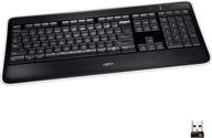
Renewed Logitech K800 Wireless 💡 Illuminated Keyboard: Brighter, Better, and More Convenient

204 Review
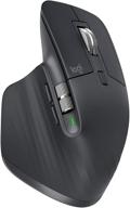
Renewed Logitech MX Master 🐭 3 Advanced Wireless Mouse: Exceptional Performance Guaranteed

233 Review


