
Review on ViewSonic VX3276-MHD Frameless Widescreen Display with DisplayPort, Backlit, 1920X1080P at 60Hz by Justin Thompson

Attractively priced. Difficult to find the right settings. Just a little bleeding. Worst standing ever. Otherwise good potential
There aren't many decent screens with IPS panels in this price range. Few of them even compete with it - most are much older and have fewer features. So for that range I'd say it's a pretty decent choice and probably one of the best choices out there. Basically there are only a few things that keep it from being great. First, the settings are simple. Poorly. The default settings it offers for a lot of things are bad. In particular, if you set it up for gaming, the default "Response Time" setting will be set to "extended". Which sounds good right? Except that this does some processing that actually generates significant ghosting (leading some people to believe that the seemingly high latencies are just too long. But 7ms doesn't really result in the ghosting you see with it. In fact, it would be more on the order of 15ms or maybe even 20ms My best guess - and that's just a guess - is that the Advanced or Ultra "Response Time" settings actually involve some sort of intelligent image processing that does more harm than good. ) Manually setting this option to "Standard" corrects ghosting. I was able to play very fast games with no issues after setting the standard, so the 7ms response time that scares a lot of people is actually normal. (And there are actually several ways to measure response time - in fact there are different responses that SHOULD be measured and provided to the client, but of course not - so 7ms isn't really that far from what a modern panel A TN 5ms or The bottom screen might actually work in practice.) Also, the color and lighting settings are quite difficult and confusing to get right. For example, sRGB actually indicates a very warm color, not a neutral one. I had to configure a lot manually. Unfortunately I don't have anything to calibrate the monitor (surprisingly it's hard to find something for external calibration - I get an old Spyder 2 for software calibration, but it would be really better to find the right settings to get the settings correct change .) When I set the extended DCR to 0, the black stabilization to 50 (specifically it's hard to figure out, but so far I think 50 is the closest to the fix, but I'm a bit back and forth between 50 and 60 cunning) Contrast to 50, brightness lowered to my liking (35, maybe a little higher would be a little more ideal for a lot of people), and colors are user controlled (each 100% in RGB at the moment - I'll have to figure out how to tweak that to make them it's even more neutral, but it's pretty good for starters), it's pretty close to something that feels very neutral and realistic. The yellow tones in particular look a bit odd, so I'm still not entirely sure and will one day look for a way to calibrate them better with these settings. Как только вы установите правильные настройки в целом, это довольно приятно и, безусловно, достаточно хорошо для большинства целей (достаточно близко даже для многих целей обработки изображений, я думаю, хотя, если вам нужен 100% sRGB, я уверен, что это не подойдет .) I think. With the right settings it can be quite incredible, it's really just a matter of understanding (which I haven't quite gotten yet). Although with my current settings most of the test photos, nature scenes etc look pretty amazing now. A HUGE point against - the stand is absolute crap. They really screwed up that part. First, you cannot get a third-party item. No holes for VESA mount or anything like that. As far as I know, the stand doesn't use a standard connector (it snaps in at the bottom). The problem is that it screws loosely into a single pole that extends up to the monitor. And no matter how you dress it up, it can still be pretty loose. Just to be clear, the flat wooden table I set it on is almost completely level (less than a degree off. Nothing major). rotates so much) the stand is not level. It even leans away from the table for some reason, so I know it's 100% the stand's fault here. And it goes without saying that with just a tiny thin rod bolted in this way, problems like this can arise. That's why most coasters that snap, like this one, are at least a lot wider. I had to add so much padding on the left side that it was raised almost a full FIVE millimeters. (By contrast, my desk is tilted two folds of paper, not even a millimeter.) With no screw holes, you can't even use a third-party stand. They're just pinned to compensate for a screen that may or may not tilt a lot. And to be honest that's the main reason I'm deducting two stars from his rating because once one of them has the right settings they can share them with others but fixing a stand that isn't level takes quite a bit a lot of work. . I got the foam for just a buck that I could cut and glue to the floor in layers so I think it's easy enough to fix, but I encourage you to make that horrible design decision with this stand. . It may look nice, but in practice it's just terrible. Especially on one side with material behind it. I used sticky craft foam (1.5mm thick in this case) bought locally for just a dollar and I can't find anything equivalent here, but uxcell 2Pcs is 12mm wide and 1mm thick. 10 Meters Single Side EVA Sponge Foam Tape can be a good choice for those who need to handle it in the same simple way. Finally, backlight bleeding is not very pleasant. This is unfortunately standard with cheaper IPS panels, so I don't mind. This is only a problem if you're doing something with a lot of black people, like certain games and maybe some movies. Probably not much photo work, but if you're looking at an IPS panel, definitely don't look for cheaper ones like this. One thing to note here: It's actually pretty uniform. Most of the IPS panels I use are very uneven in their light transmission. Usually this is one or two corners, which can be either up or down. And the bleeding tends to be pretty extreme. You will have a spot that looks almost white while everything else around it is black. Both better and worse with this monitor. Where they're confined to a really small area, here they're much more evenly distributed. This means there is a much larger area affected by the permeability that all blacks suffer from, but also much less actual permeability in each area in comparison, so blacks don't suffer as much as they do. What's better or worse is more a matter of personal preference than anything else, but I think it's less bad overall, probably because it's more consistent and less disruptive. I think there is a lot of potential here. I find that with the right settings it can have pretty amazing colors. I think this could possibly even be one of the best options available for its price range. There are a few rare ones that might be cheaper and a few others in this range, but visual quality is the most important thing for an IPS panel and I think it might have an advantage in this price range. If you're willing to climb into the $500+ range this isn't the way to go, but at this low price point it at least outperforms others I've compared it to in actual visual quality once I set it up correct. The stand is a huge splendour, but at least it's not that difficult to make up for with the right materials. I don't think the user should be doing this, and the packing stuff under one side to support it kills any fashion benefits of its design anyway, so it just needs to be replaced with a real kickstand instead of the awful Ultra. - a thin triangular piece. UPDATE: The Spyder2 has arrived. After hard work tracking down the drivers they removed from their main site, I finally managed to find the old drivers before they removed them all (on their Japanese site, ironically). It turns out that their software supports built-in screen calibration. -in controls before creating a color profile. I found that with the standard 2.2-6500K calibration I was told to set red to 100, green to 91 and blue to 88. The result is around 6467K, which is as close as possible to the RGB output. even if it is (blue is either too little or, by a small margin, too much, and green is very little too, but generally all three end up pretty close and within the acceptable range). The brightness may change. higher and this affects the output somewhat, but any increase in brightness bothers my eyes so I can't give adjusted values at higher settings. Oddly, this is actually very close to what sRGB delivers, but according to the calibration tool, sRGB has way too much green. On the other hand, the ICM it creates after manual RGB calibration overcompensates greens, so grays have a green tint, so maybe the sRGB setting really is accurate. I can't say why it seems too warm to me, but if you want as close to sRGB as possible you might be better off just using this built-in profile. I also use ICM, which ViewSonic provides through its monitor driver, although I don't see much of a difference with and without. Without something external or a newer, higher quality calibration tool to compare, I can't calibrate any better.
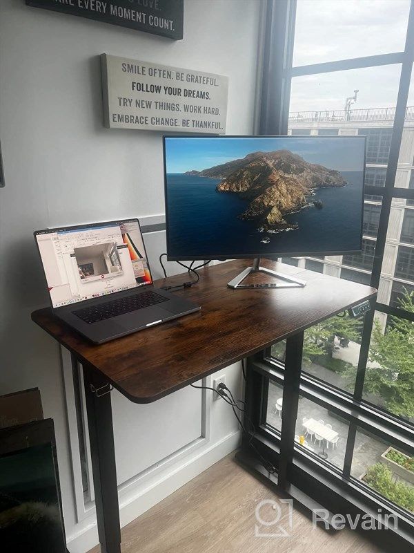
- A very good monitor. Very simple construction. Has worked flawlessly
- badly thought out
New products
Comments (0)
Similar reviews
Top products in 🖥 Monitors
Dell SE2416HX Screen LED Lit Monitor 23.8", 1920X1080P, HDMI

93 Review
Dell E2318Hx LED Lit Monitor: High-Definition Display with Flicker-Free Technology and IPS Panel

109 Review

Dell SE2216HV LED 💻 Monitor with 60Hz Refresh Rate

101 Review
Sceptre C325B-144R: Advanced FreeSync HD Display with Wall Mounting and Tilt Adjustment

94 Review
Another interesting products
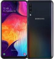
Smartphone Samsung Galaxy A50 4/64 GB, 2 SIM, black

82 Review
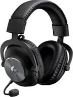
Renewed Logitech G PRO X Wireless Lightspeed Gaming Headset with Blue VO!CE Mic Filter for Immersive Gaming Experience

122 Review
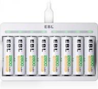
50AA2500 EBL Individual Battery Charging System - Rechargeable Batteries

56 Review
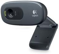
🎥 Logitech C270 Webcam: Crystal Clear Video and Superior Quality

183 Review

