Review on Earto D233 Backlit Wireless Keyboard And Mouse: Fixed Rainbow Backlight, Type-C Rechargeable, Full Size For Windows PC And Laptop by Ray Welchhance

Phenomenal! Just a couple gripes.
Let me be very clear: this is my new favorite keyboard and mouse. I have just one other standalone keyboard that I like almost as well, and if I could combine their strengths into one, I'd have my perfect, ideal keyboard.Pros:I love the lights, I love the functionality, I love the key layout, I love the design. The keyfall seems to be great, even if it's at the high end for me. Every single key is properly centered, so none of them have so far caught on the lip of the faceplate like they have on some other keyboards. The 10-key pad is really wonderful. The inclusion of an additional Win key is a phenomenally useful decision the importance of which I can't understate. I use it all the time. I mean all the time. The mouse surprised me. I thought I was going to hate the shape, but I love it. It functions flawlessly, and so does the jiggler. I have zero problems with the mouse at all.Cons:None. I mean it. I only have a few gripes that don't really affect anything.Exceedingly minor nitpicks that are neither pros nor cons and probably won't bother anyone else but me:Clackiness is maybe a smidge high in volume for me, but it's fine. Fans of mechanical keyboards will like it better (even if it's probably quiet for them), but I don't like any clackiness in my keys because I have misophonia and it can get irritating after a while. I don't see this volume level getting irritating, though. The key clack does sound a bit hollow (which is accurate because the keys are indeed hollow to allow the light to pass through and the armature to have a place to exist and connect), it's just that the hollowness gives it a cheap sound that contributes to a slightly cheap feel. The character keys that are most used for typing are concave, while the function keys and others, like Ctrl, Alt, and Win, are all convex. This just makes for a mildly frustrating lack of consistency that doesn't actually affect anything other than aesthetics. Related to this, I'm not sure what caused the decision to use "Win" instead of the Windows logo, but I wish it had been the Windows logo instead. That would have been far classier. This is weird, but the kerning between letters and the character width and height are pretty wildly inconsistent. It's most noticeable when you look at the Win and Alt keys (see pictures), but you can see it with plenty of other keys.Verdict:I know I left a lot more about irritations than pros, but believe me when I say the pros vastly outweigh the irritations, and there are no cons. I highly recommend this.
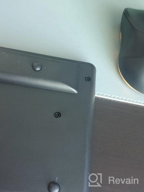
- I love everything the only improvement I could make is for the backlit keyboard to stay on longer
- Just bought a keyboard for a week, some keys often fail, the experience is really bad.
New products
Comments (1)

Similar reviews
Top products in 📱 Phone Accessories
NinjaBatt High Performance Battery For Toshiba A665 And L755 Series - 6 Cells/4400MAh/48Wh

40 Review
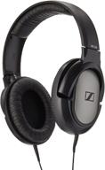
Sennheiser HD 206 Closed-Back Over Ear Headphones - Discontinued Model

195 Review
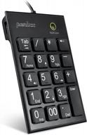
Perixx Peripad-202H Black Wired Numeric Keypad With X-Scissor Keys, 2 USB Hubs, And Tab Key For Enhanced Productivity

44 Review
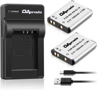
2 Pack EN-EL19 Battery & Rapid USB Charger For Nikon Coolpix S32-S7000 Cameras - OAproda

41 Review


