
Review on Samsung Galaxy S10E GSM Unlocked 📱 Phone with Dual 12MP Camera and 128GB Storage by Jihu Gim ᠌

It works, but I don't think I'll be buying it again.
I took it as a replacement for the extremely successful Galaxy S7. Unfortunately, this is the only phone on the market with a normal camera, protective glass and dimensions that fit into a jeans pocket. There is also Mi 9 SE, but there is a protruding camera block and the absence of a minijack. Impressions in comparison with S7 are only negative. Everything got worse. They even managed to make the phone narrower, and now the text fits in width less. Slightly better camera, more RAM and physical memory. On this, the pluses with a model that costs three times cheaper end. So it goes.
- +++ Dimensions. Fits in any pocket of a jacket or jeans. With it in your pocket, you can walk and sit down. +++ No need for a case. The phone does not swing on the table due to the protruding block of cameras. ++ Headphone jack ++ Everything that is considered the norm for the S-series: Normal camera, Real Gorilla Glass, Water resistance, High-quality sound, support for all the latest Wi-Fi and Bluetooth.
- - Bixby button. This is the worst thing that Samsung has come up with in the last two decades. Useless, interferes, frankly infuriates. No useful action can be assigned to it. - Very inconvenient Shutdown button! You have to press deeply on her. You can't just turn off the screen with a flick of the wrist. To press inward, you need a stop on the other side. And exactly opposite, on the other side, there are volume buttons . In attempts to turn off, you constantly press on them and knock down your volume settings. If the phone is on the table, you can’t just turn off the screen with your finger. You have to pick up your phone. This is a failure. - It is extremely inconvenient to take screenshots. For fun, I ask friends who seem to like the phone to take a screenshot of the screen. And I look at their facial expressions of surprise in an attempt to press all these tiny uncomfortable buttons at the same time. - Inconvenient sound adjustment. Previous phones had separate buttons for + and -. It was convenient to press them without looking. Now instead of - there is a Bixby button, which you constantly click on. Tactilely feel in your pocket where the plus is, and where the minus is impossible. - Compared to the Galaxy S7 with the same dimensions, the screen has become narrower! Yes Yes. To make these idiotic long proportions, they ate the critically needed space in width. Text in vertical mode fits less than on a phone 3 years ago with the same dimensions. - Screen buttons are not the best solution. Touch / Mechanical were more convenient. - A hole for the camera is not the best solution.
New products
Comments (0)
Similar reviews
Top products in 📱 Cell Phones

📱 Huawei P40 Lite JNY-LX1 International Version - 128GB Crush Green, Dual 4G and 6GB RAM

297 Review
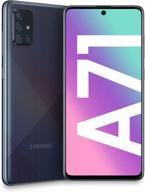
💫 Renewed Samsung Galaxy A71 5G Fully Unlocked (128GB, Prism Cube Black)

354 Review

💎 Renewed Samsung Galaxy S8 64GB Coral Blue Fully Unlocked Phone

383 Review
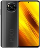
Xiaomi Poco X3 NFC DotDisplay

313 Review
Another interesting products
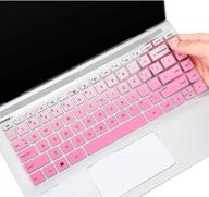
Keyboard Cover For HP Pavilion X360 14 14-Dk 14M-Dh 14-Dq/Dh 14-Fq 14-Ce/Cf 14T-Dh200 14-Dq0070Nr 14-Fq1025Nr 14-Dq0011Dx/Dq0004Dx/Dq0002 14-Dh2011Nr Fq1097Nr 14T-Dq300 14Z-Fq000 14-Cb185Nr, GPink

39 Review
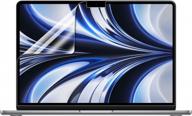
F FORITO 2-Pack Anti Glare Screen Protectors For 2022 MacBook Air 13.6" With M2 Chip - Protect Your Device From Scratches And Fingerprints

33 Review
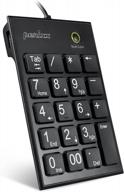
Perixx Peripad-202H Black Wired Numeric Keypad With X-Scissor Keys, 2 USB Hubs, And Tab Key For Enhanced Productivity

44 Review
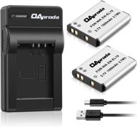
2 Pack EN-EL19 Battery & Rapid USB Charger For Nikon Coolpix S32-S7000 Cameras - OAproda

41 Review


