1 Level
744 Review
54 Karma
Review on FA Platform by Efrain Khan

Most advanced robo advisory platform for retail investors
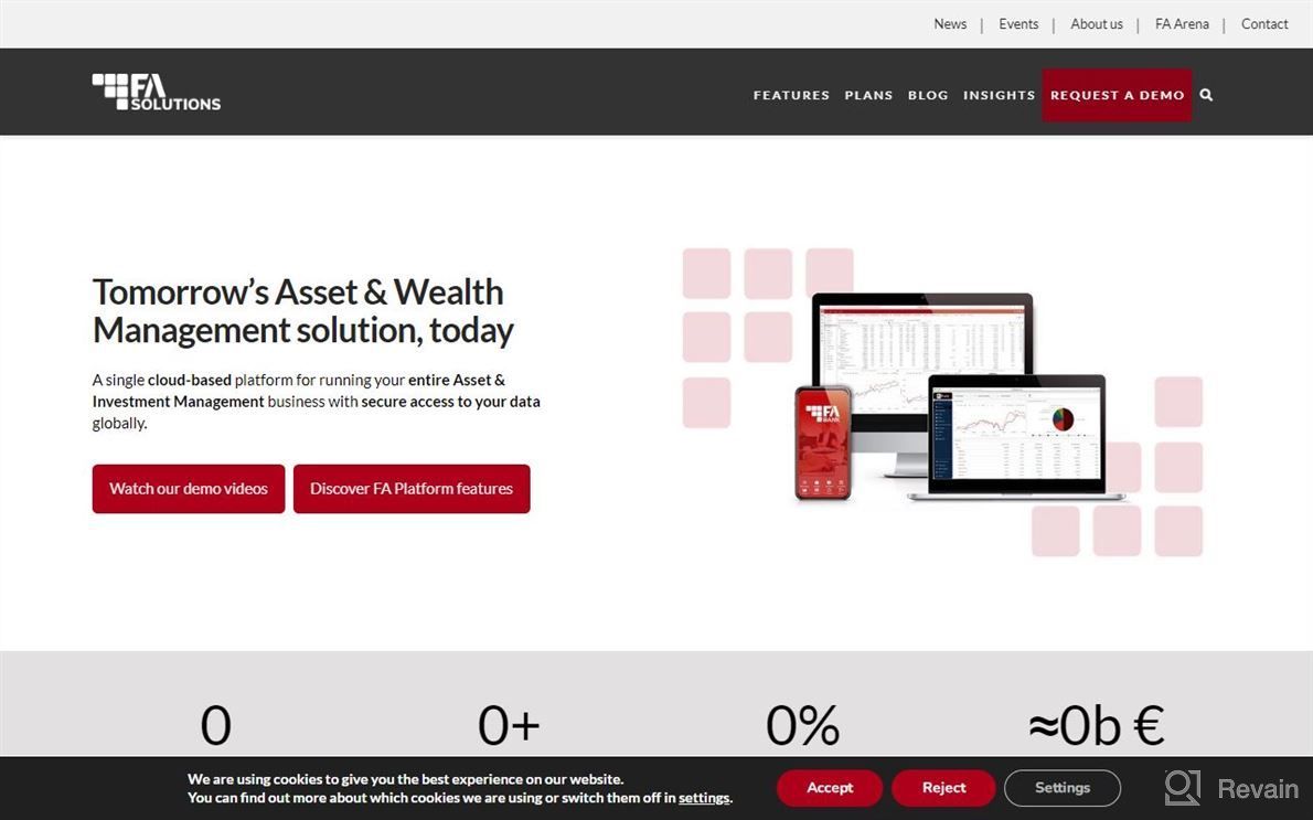
At first glance it is clear that this system has been designed from scratch to be as user friendly and intuitive as possible. It's not difficult at all once you get used to how everything works (and most things are pretty self-explanatory). The layout of some screens can look somewhat outdated but nothing I wouldn't expect with such an young product out there right now! There is still quite much room left to improve upon both UI/UX wise and functionality wise. We have implemented a new client portal which will allow our clients full control over their portfolio allocation - while also allowing us complete transparency into its status across multiple asset classes and timeframes per account holder.

Pros
- Good UX / visual appeal.


