
Review on Samsung Official Cover Galaxy Ultra by Adam Tomasz ᠌

Overall pretty good, an equal number of pros and cons.
The "frame" of the matrix is probably too narrow . When you work with the device, you involuntarily "climb" onto the sensor field of the matrix with the end of any finger and there is a mass of unwanted responses caused by this . The narrow frame of the matrix is, of course, cool to "show off" and technological To show "coolness" to competitors, but the user from false positives is one frustration . My wife has an e-book Pocket Book Pro, so there, too, with narrow margins, they got stuck to such an extent that it’s impossible to hold it in your hands normally - only from the bottom on the palms, if it’s normal, then the touch screen starts to work . Well. a lot of money was paid for it, so I had to cut a fiberglass substrate a little wider than this e-book and stick it on the bottom with double-sided tape so that my wife could hold the book in her hands normally . I would have done this here, but here - WITH A STYLUS, HOW TO BE, A.? SAMSUNG?
- The thing, of course, frankly, is FABIOUS, well, in everything that is characteristic of this type of device . Considering its functions as a TABLET (and some confuse it with some other devices) - there’s nothing to complain about.
- But what is absolutely terrible is the STYLUS . No, functionally everything is in order with it, but how and where it is placed and how it is attached - . Some very - so say - very bad words that could to describe this disgrace fairly - well, I just don’t find it . So that the designer of this wallet with a salary in his pocket holds on like he “prohibited” the stylus attachment .
New products
Comments (0)
Similar reviews
Top products in 💼 Tablet Bags, Cases & Sleeves
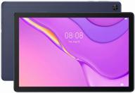
10.1" Tablet HUAWEI MatePad T 10s (2020), 4/128 GB, Wi-Fi, deep blue

61 Review

Logitech K380 Multi-Device Wireless Keyboard Pink, English

33 Review
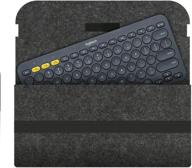
Logitech K380 Keyboard Sleeve - Felt Travel Bag Case, Wireless Keyboard Sleeve for Logitech K380 Bluetooth Multi-Device Keyboard (Felt- Deep Grey)

30 Review
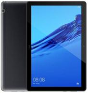
10.1" Tablet HUAWEI MediaPad T5 10 (2018), 3/32 GB, Wi-Fi + Cellular, Android 8.0, black

49 Review
Another interesting products
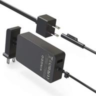
💡 KINGDO Surface Pro Charger 36W - Compatible with Surface Pro 3, 4, & 5 - Including Carrying Pouch

9 Review
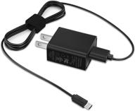
🔌 USB Micro Charger with 5 FT Charging Cable Cord - Compatible with Samsung Galaxy Note, Tab A, E, S2, 3, 4, 7.0" 8.0" 9.6" 9.7" 10.1", SM-T280/ 350/580/ 560/530 Tablet, Phone Galaxy J8, J7, J6, S7, S6, S5

8 Review
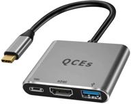
USB C to HDMI Multiport Adapter with 100W PD Charging, Thunderbolt 3 to HDMI Hub 4K 💻 Video Output Compatible with MacBook Pro/Air 2020/2018 iPad Pro/Air 2020, Galaxy S20/10 - QCEs USB-C to USB 3.0 Adapter

10 Review
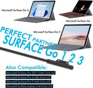
🔌 24W 15V 1.6A Charger Adapter for Surface Go/Go 2, Surface Pro 4 Core m3, Surface Pro 3 Core m3, Surface Pro 2017 Core m3, Surface Laptop Core m3 - Includes Travel Case

8 Review

