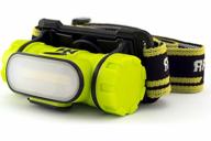
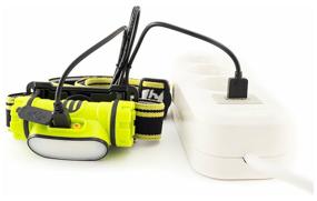
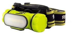
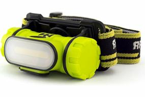
Of the shortcomings, I would single out the power button. It is almost flush with the body and does not stand out almost, with gloves it is difficult to find and press it. It would be better to make it slightly protruding or recessed, but highlight the landing site itself with some kind of projections. This brings discomfort. Also switching modes, I would like some kind of scrolling to adjust the beam power . . The button is still not convenient, switching is also not very convenient, if you press immediately, the modes change from the brightest and descending. But, if you wait for some time, for example, you are working, the light is too bright and you need to make it weaker, then by pressing the button it will first turn off, then turn it on again and poke to the desired mode. This is long and, given the inconvenience of the button, creates problems. A knob would be an ideal solution, or another button, softer, purely for modes, and turn on / off done separately. Another minus, now very common, is a charging socket with micro usb, there has been typesi for a long time, this is not an innovation, why not do it right. I already have almost no devices with micro usb, all chargers are with typesie. This causes discomfort too. You have to change the charging cable, it’s the same in the power bank, carry an extra wire with you, which is always lost among working things in a backpack. Other than that, I don't think there are any cons.
