
Review on Smartphone Samsung Galaxy S22 8/128 GB RU, black phantom by Gabriela Dosta ᠌

A little bit not what I expected, generally fine.
The "Disadvantages" section has been erased, but the problems remain. But, I won't torture the reader by repeating the obvious criticisms that have already been made; instead, I'll focus on a more subjective issue, namely the design of the interface. Not only is it less stunning on the S8, but the comfort level is also lower. If the first is subjective, the second is unavoidable: you cannot arrange a grid of six frames across the width in the native gallery; the options are four or eight. In contrast, the S8 made this a realistic option. Despite this, on S22, silly frames were added between frames for no reason other than to use space, and you can't get rid of them. There will always be those who say these are petty concerns, but remember that people's first impressions of a product are often formed based on their impressions of its less noticeable components. Comparing the S22 to the earlier S8, which is on par with the most cutting-edge iPhone Pro models in terms of perceived quality, is a no-brainer. Those who haven't used a Samsung Galaxy S8 or S9 may find this hard to believe, but it's the truth. The sleek and symmetrical metal frame, the superfluous but lovely curves of the screen and back on the sides, and the way it lays in the hand all contribute to a tangible impression of the gadget. However, in terms of both aesthetics and general quality, S22 is the cheaper option. If you want proof that the new S8 is not subpar and that the wow factor has been amplified even further, all you have to do is visit an Apple store near you and make a side-by-side comparison (not with the ordinary series, but with the Pro series). This review is directed primarily towards folks my age or older who, like me, own a Samsung Galaxy S8 or S9 and have been seeking for a replacement phone for quite some time while avoiding the newest Samsung models due to their asymmetrical designs. I'm also sending a copy of this evaluation to Samsung's local representative office in the hopes that they'll share it with Samsung's headquarters in the hopes that one day Samsung will produce another product as legendary as the S8. Curved screens are not required, but you must build a device about the size of an iPhone mini or slightly larger, with a significantly thinner profile, a memory card slot, and a mini-jack. I have already detailed the other requirements. Nevertheless, these are not extremely passionate sentiments; around a month has gone since the purchase of the S22. Samsung, you have the ability to accomplish anything you set your mind to; all you need to do is remember.
- It's not easy to find positives in a situation, and although I used to have a lot of affection for the Samsung Galaxy S8, I'm very disappointed that I can't find a single moment that I truly enjoy, despite the fact that there are a lot of drawbacks and the fact that it doesn't differentiate itself from other similar products on the market. I decided with the option that gave me the most color options, a graphite back and a matte black frame. If this variant of the S22 wasn't offered, I never would have considered buying one because the alternatives seem less attractive and fashionable (subjectively). But, it's worth considering the possibility that putting off the purchase is in fact the wisest move.
- I will do my best to prioritize the issues by how much they matter to me personally, as follows: One, the primary camera frequently takes photos with lesser quality than my S8 from five years ago. Occasionally the S22 produces better results, but this is hardly the breakthrough I was hoping for (the phone for me is in many ways a camera). While I took a gazillion photos to compare and studied them digitally, I won't delve into specifics, but the S22 has been known to make silly blunders that the S8 would never have made. The images the older man takes are better in every way, including clarity. 2) Despite the size reductions in recent years, I still find the dimensions to be excessively huge (this is not the plus version). The case makes one-handed use of the phone extremely difficult. Wider and thicker than my S8, which fits in my hand almost perfectly (albeit I'd want even less, like the iPhone 12/13 mini), the dimensions are noticeable. The device's protruding cameras make using it without a case next to impossible; you can't even get it to rest flat on a table, and you need more than one finger to operate it. Thirdly, the display is unusable. You can have as many glowing reviews as you like, but I can say that it outperforms the most recent iPhone and the S8 I held. The S22 display is noticeably worse, but for some reason my mind just can't wrap around it. And now I don't even want to use it! It's a vivid green, to start. The manual adjustment did help, but I have both the S8 and the S22 on the table in front of me, and even on the Always On Display, I can tell that the S22's white is defective while the white on the S8 is flawless and nice. The manual mode improved things marginally. 4) I was aware going in that there wouldn't be a micro-SD card slot, but I was hoping that the benefits would exceed this minor inconvenience. This drawback had been anticipated, yet it was still a letdown. The biggest annoyance, though, is that the speed at which one may store photographs and movies has not increased. 5) Since this topic has been covered extensively elsewhere, I will not rehash the same points on performance and autonomy. I should preface this by saying that I had been under the notion for the previous few years that the problem was with my old S8, which suffered from a variety of problems and drained its battery far too quickly. But even with a fresh new, never-before-used S22, I experienced sluggishness in the interface.
New products
Comments (0)
Similar reviews
Top products in 📱 Cell Phones
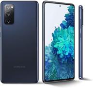
Samsung Galaxy S20 FE G780G 4G Dual 128GB 8GB RAM Factory Unlocked International Version - Cloud Navy (GSM Only)

324 Review

Unlocked Apple iPhone 7, 📱 32GB, Black (Refurbished) - Enhanced for SEO

318 Review

Xiaomi Camera Gaming Processor Unlocked

397 Review

Renewed Samsung Galaxy A50 Verizon Smartphone in Black with 64GB Storage

569 Review
Another interesting products
Keyboard Cover For HP Pavilion X360 14 14-Dk 14M-Dh 14-Dq/Dh 14-Fq 14-Ce/Cf 14T-Dh200 14-Dq0070Nr 14-Fq1025Nr 14-Dq0011Dx/Dq0004Dx/Dq0002 14-Dh2011Nr Fq1097Nr 14T-Dq300 14Z-Fq000 14-Cb185Nr, GPink

39 Review
NinjaBatt High Performance Battery For Toshiba A665 And L755 Series - 6 Cells/4400MAh/48Wh

40 Review
2 Pack EN-EL19 Battery & Rapid USB Charger For Nikon Coolpix S32-S7000 Cameras - OAproda

41 Review
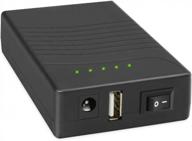
Rechargeable 12V 3000MAh Lithium Battery Pack: Power Bank For LED Strip, CCTV Camera & More

43 Review


