
Review on Apple iPhone 13 Pro Max 128 GB RU, nano SIM+eSIM, gold by Vassil Ivanov ᠌

Product satisfying the quality of the product, good price.
Apples, in general, are still rather young. The pinnacle of effective marketing. Despite the fact that they have less features than Android smartphones, many consumers are still willing to pay a lot of money for them. They need just borrow and adapt features from Android to have a workable alternative to portray as original work. People will be drawn in by the "quality" and distinctness of the apple, and they will be astounded by it. I purchased it in KZ for 580,000 tenge plus an additional 10,000 tenge in fees, and as a free bonus they gave me a cover and some glass stickers. 1 ruble was equivalent to 7.5 tenge when exchanging currencies. 256GB. American. The communication flows smoothly and without hitches.
- - The duration of the battery life. After a night of idleness, the batteries in all of my Android devices (S3, S7, and S10e) would drain by 15-20% on average. During the course of the night, the iPhone loses only 1% to 2% of its power. Was surprised to hear that. - I liked Face ID. intelligent and spot-on. Not only does it work on the camera, but it also functions on at least four of the sensors. Because of this, the eyebrow is quite large. - Video quality. Photos are typical. They believe that it will be sufficient for a considerable amount of time because it has a nice appearance. help for a period of five to six years. It is possible to drown at depths of up to 6 meters (did not check).
- Virtually every security hole has some connection to the underlying operating system. - There is no "back" button. Instead, it allows you to swipe right from the left side of the screen to access the menu. But despite this, a gesture can indicate something entirely different depending on the data application, and sometimes you will still need to reach for the top left side of the screen. - Limited choices for customizing the desktop and the absence of a standard menu for accessing applications. Every icon is making its way upward. Only a maximum of four icons are allowed at the bottom. - No file manager. - The regular calculator gave me several occasions for hilarity. It merely shows the number that I enter into it rather than displaying the entire statement. I can hardly make out what it is that I'm putting together. Are you inviting me to bear in mind such formulations, example, that include ten or more operations? Well, fine, you can say normal - There is no option to adjust the volume of the alarm independently; rather, the loudness of the alert is always the same as the volume of the call. Pain. It would be more helpful if it also displayed how long the alarm would continue to go off; I like to count how many more hours of sleep I have left before I have to get up. - Via the app store in its entirety. You cannot download an.apk file and then install it like you would on an Android device. Amazon, goodbye. Windows does not allow users to just snap pictures and videos and then transfer them to a computer. You will require iTunes, and you will need to transfer your photos via the Photos program on your Windows computer. It is fairly unusual for the connection to become lost when downloading something. - Charging is a "special" process, as is the wire itself. It does not appear that the wire can be trusted. Three years, if all goes well. - Unable to access previously saved wifi passwords It is not possible to close all applications at once; instead, you will need to swipe away each one individually. - Heavier than expected - No fingerprint scanner present. On S10E, it worked pretty well for me. It sticks out quite a bit from the background of "ordinary" smartphones, particularly due to the enormous camera block that it has. When people see you, they automatically assume that you have money. Those things related to status. People that are more reserved won't be able to relax. In general, the operating system has less features than Android has. Even on my very first smartphone, which ran Android on a Galaxy S3, there were more choices for personalization. Apple portrays this as a philosophy of simplicity and "nothing more," suggesting that there is nothing else that could go wrong.
New products
Comments (0)
Top products in 🔌 Car Electronics Accessories
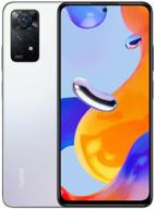
Smartphone Xiaomi Redmi Note 11 Pro 8/128 GB RU, Dual nano SIM, white ice

148 Review
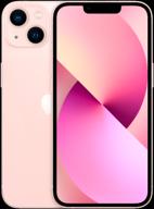
Smartphone Apple iPhone 13 mini 128 GB, nano SIM+eSIM, pink

109 Review
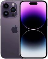
Smartphone Apple iPhone 14 Pro Max 256 GB, Dual nano SIM, deep purple

106 Review
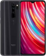
Smartphone Xiaomi Redmi Note 8 Pro 6/128 GB Global, 2 SIM, Mineral Gray

91 Review
Another interesting products

Westin White Tea Home Diffuser Refill Cartridge - Signature Hotel Fragrance & Scent

16 Review

✨ AIMISUV Blue Light Blocking Glasses 2Pack - Anti-Eyestrain Computer Gaming Glasses (Black Gold+Crystal Gold)

9 Review
🎥 2-Pack of 60-Minute Mini DVC Tapes

5 Review

✨ Alleviate Eye Fatigue with ANRRI's Featherweight Anti-Blue Light Glasses

4 Review

