
Review on 💻 Samsung T35F 27-Inch IPS Borderless Monitor with FreeSync, 1920x1080P and 75Hz Refresh Rate (Model LF27T350FHNXZA) by Jonathan Cardenas

But it would be 5.
The location of the on/off switch is ridiculous, as is how it works. When the blue light is on, the monitor is effectively off. And when you don't see the light, the monitor is on. Who thought it was a good design? One of them is below right. You need to stretch under the monitor. Feel it. Then click on it to reveal the disabled options on the screen. When you press it, it doesn't do anything for a few seconds, and only when you're wondering if it's working properly does a menu pop up. Brilliant engineers. Please stop helping and put the power button back on the front panel. Also, green means on, red or dark means off. The blue light tells most people the monitor is on, not off.
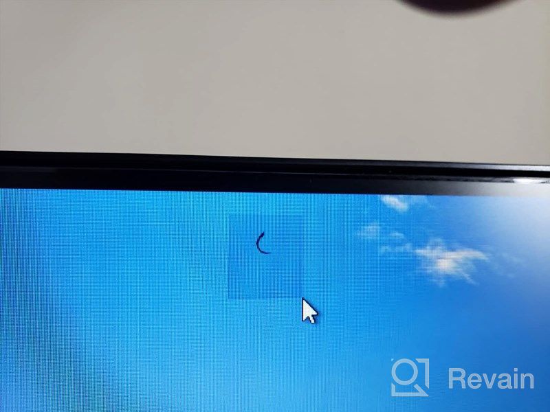
- I like this.
- Limited Connectivity
New products
Comments (0)
Similar reviews
Top products in 🖥 Monitors
Samsung Flat Monitor Super Slim Design 27", 1920X1080P, 75Hz, Flicker Free

112 Review
Dell SE2416HX Screen LED Lit Monitor 23.8", 1920X1080P, HDMI

93 Review
Sceptre C325B-144R: Advanced FreeSync HD Display with Wall Mounting and Tilt Adjustment

94 Review
🖥️ Revolutionize Your Interface with Planar PXL2230MW 22 Inch 16 Touchscreen

97 Review
Another interesting products

🎥 Logitech C270 Webcam: Crystal Clear Video and Superior Quality

183 Review

Apple AirPods Pro MagSafe RU Wireless Headphones, White

159 Review

Renewed Logitech G PRO X Wireless Lightspeed Gaming Headset with Blue VO!CE Mic Filter for Immersive Gaming Experience

122 Review

💻 Get Amazing Video Quality with Logitech HD Pro Webcam C920 (Discontinued Edition)

83 Review

