
Review on SkyCaddie SX400 Handheld GPS Display by Bubba Ott

Horrible UX: Sports & Handheld GPS
Very simple things.1. Can't you see what hole I'm playing, par 3, par 4, par 5? Isn't that the foundation of foundations? 2. The whole opening view is the default screen that the user stays on most of the time. Then there should be a shortcut that can jump straight from any screen or setting to hole view. You have to go through a few steps to show the hole again. Even a dedicated button at the bottom would be a good idea, but overall the UX isn't very efficient and user-friendly. UX engineers need to do a better job. And there are many other things that UX does very poorly overall from a user perspective that I don't understand. wanna waste my time Return of the device after a trial period.
- High marks for support and durability from testers
- Speed
New products
Comments (0)
Top products in 🌍 Sports & Handheld GPS
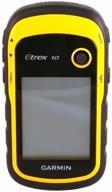
Garmin eTrex 10 Navigator

31 Review
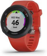
Garmin Forerunner 45: Easy-to-Use GPS Running Watch with Free Training Plan Support in Red

21 Review
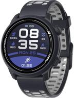
Coros PACE 2 Premium GPS Sport Watch: Heart Rate Monitor, 30h Full GPS Battery, Barometer, Strava & TrainingPeaks Compatible

20 Review
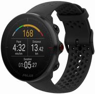
Polar Vantage M Smart Watch, Black

33 Review
Another interesting products
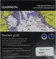
🗺️ Enhance Your Navigation with Garmin BlueChart g2 California/Mexico Saltwater Map microSD Card

7 Review
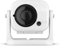
Garmin GC 100 Wireless Camera: High Quality and Easy-to-Use, Model 010-01865-30

5 Review

🗺️ Humminbird Lakemaster Plus – Black Wisconsin Contour Digital GPS Map

3 Review

C MAP M NA Y704 MS Precision Contour Carolina

3 Review

