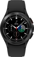
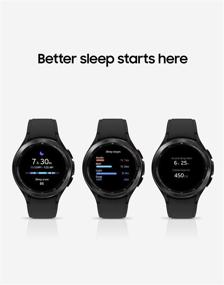
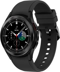
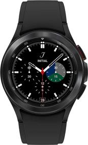
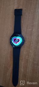
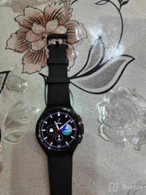
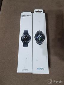
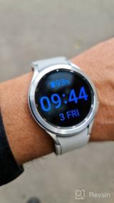
- 1. Stylish classic look; 2. The watch is light; 3. The bezel does not feel flimsy; it seems to be quite normal for Gear 3, but there are sensations. Here the bezel is like a glove; 4. A bunch of sensors. A whole bunch of opportunities to assess the state of health; ECG, BP, blood oxygen levels, stress levels, body composition; step counter; a bunch of workouts 5. Microphone, speaker, WiFi, GPS, Samsung Pay ─ all this is already a classic in Samsung watches (you can allegedly screw on Google Pay, but I am more than satisfied with the Samsung payment service!); 6. Operation and responsiveness of the interface. I read somewhere that they allegedly slow down; just let the clock load to the end. After a full download, there are no problems at all. I wear a day, slept with them, the interface flies; 7. Measurement of pressure and ECG ─ this is what I was missing!
- 1. Design in comparison with Gear 3 loses. 2. The choice of interesting watch faces in GooglePlay is less than in Tizen; those that are interesting, for money. Maybe, over time, the developers will add more, but so far so; 3. Poor kit; Includes one silicone strap. It would be possible to add and leather; Watches are not cheap! I love leather straps. He wore his Gear 3 with a complete leather one. 4. Numeric keypad ─ sucks! On Tizen there was a circle ─ a miracle, what a claudia! Everything is small here; extremely inconvenient! 5. Changed the functionality of the buttons for the heck had to transfer Power to the top, and Pay─ to the bottom? Why didn't you like the old position? Of course, you get used to it, but why change it?


