
Review on Samsung Galaxy S10E G970U 128GB Unlocked Android Phone with Dual 12 & 16 MP Camera (USA Version) - Flamingo Pink, GSM-Compatible by Anastazja Adamczyk ᠌

The average product, you can find a better one.
I got it to replace my Samsung S7, which had great sales. This is the only phone available with a standard camera, scratch-resistant glass, and a size suitable for a pants pocket. Mi 9 SE also exists, however its protruding camera block and lack of a minijack make it less desirable. No positive impressions can be found as compared to the S7. The situation deteriorated rapidly. They were even able to make the phone thinner, so that less text will fit on the screen at once. More storage space, faster processing, and a slightly enhanced camera. Here, the advantages of a model that is three times less expensive end. That's the way things work out.
- Sizes +++. Fits in any pocket of a jacket or jeans. You can go for a stroll and take a seat with it in your pocket. +++ You can put away the case. The jutting block of cameras prevents the phone from swaying when placed on a flat surface. ++ Plug-in earphones plus Everything you'd expect from a vehicle in the S-series and more: We're talking about a standard camera, genuine Gorilla Glass, durability to water, high-quality audio, and compatibility with the most recent versions of Wi-Fi and Bluetooth.
- The Bixby button. There hasn't been a worse invention from Samsung in the last twenty years than this. Ineffective, disruptive, and irritating. It's useless since it has no clear purpose. Very annoying Put it to sleep! Deep pressure is required on her. You can't just flip your wrist and the screen goes dark. You can't push inward without a counterpoint on the other side. The volume controls are located on the other side, just opposite the power button. You keep pressing them, accidentally lowering the volume, in an effort to shut off. You can't merely swipe your finger over the screen to switch off the phone if it's sitting on the table. You must answer the phone. This endeavor has failed. - Taking a screenshot is a massive hassle. Simply for fun, I'll invite anyone who have expressed interest in the phone to snap a photo of the interface for me. I try to press all these little unpleasant buttons at once while watching their shocked expressions. - The volume control was a major annoyance. Before, Plus and - on mobile phones were two different buttons. It was practical to use them blindly. Instead of, you now make frequent use of the Bixby button. Feel where the plus is and where the minus is impossible by touching the bills in your pocket. Screen width is down compared to the similarly sized Galaxy S7. Sure, sure. They sacrificed much-needed width in order to achieve these absurdly lengthy dimensions. Less text can be displayed in vertical orientation on a modern smartphone compared to a device from three years ago with the same dimensions. - Buttons on a screen are not the optimal method. The mechanical and touch options were more practical. - An opening for the camera is not an optimal strategy.
New products
Comments (0)
Similar reviews
Top products in 📱 Cell Phones

📱 Huawei P40 Lite JNY-LX1 International Version - 128GB Crush Green, Dual 4G and 6GB RAM

297 Review

Renewed Samsung Galaxy A50 Verizon Smartphone in Black with 64GB Storage

569 Review
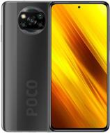
Xiaomi Poco X3 NFC DotDisplay

313 Review
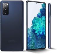
Samsung Galaxy S20 FE G780G 4G Dual 128GB 8GB RAM Factory Unlocked International Version - Cloud Navy (GSM Only)

324 Review
Another interesting products
F FORITO 2-Pack Anti Glare Screen Protectors For 2022 MacBook Air 13.6" With M2 Chip - Protect Your Device From Scratches And Fingerprints

33 Review
2 Pack EN-EL19 Battery & Rapid USB Charger For Nikon Coolpix S32-S7000 Cameras - OAproda

41 Review
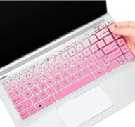
Keyboard Cover For HP Pavilion X360 14 14-Dk 14M-Dh 14-Dq/Dh 14-Fq 14-Ce/Cf 14T-Dh200 14-Dq0070Nr 14-Fq1025Nr 14-Dq0011Dx/Dq0004Dx/Dq0002 14-Dh2011Nr Fq1097Nr 14T-Dq300 14Z-Fq000 14-Cb185Nr, GPink

39 Review
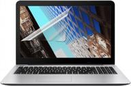
2PCS Pack 15.6" Laptop Screen Protector | Compatible With HP/DELL/Asus/Acer & More | 16:9 Display

41 Review


